Light & Airy, but Make it a Mood:Color Palettes for Creatives
When it comes to design, color isn’t just about what looks good; it’s about what feels good. And sometimes, the vibe you’re after is calm, fresh, and oh-so-inspiring. That’s why I pulled together this collection of Light & Airy color palettes, but I wanted to make them a whole mood.
These palettes aren’t just pretty swatches, they’re a vibe. Think fresh mornings, breezy days, and that moment when sunlight pours through the window just right. Whether you’re updating your brand, refreshing your website, or looking for inspiration for your next creative project, these colors will help you capture the mood.
Why Light & Airy Feels Like a Whole Mood
Light and airy colors have a way of softening everything they touch. They bring:
- Freshness – colors that feel open, breathable, and new.
- Calm energy – perfect for building trust and approachability.
- Creative spark – an uplifting backdrop for your ideas to shine.
When you design with these palettes, you’re not just choosing colors—you’re setting the tone for how your work is experienced.
The Palettes
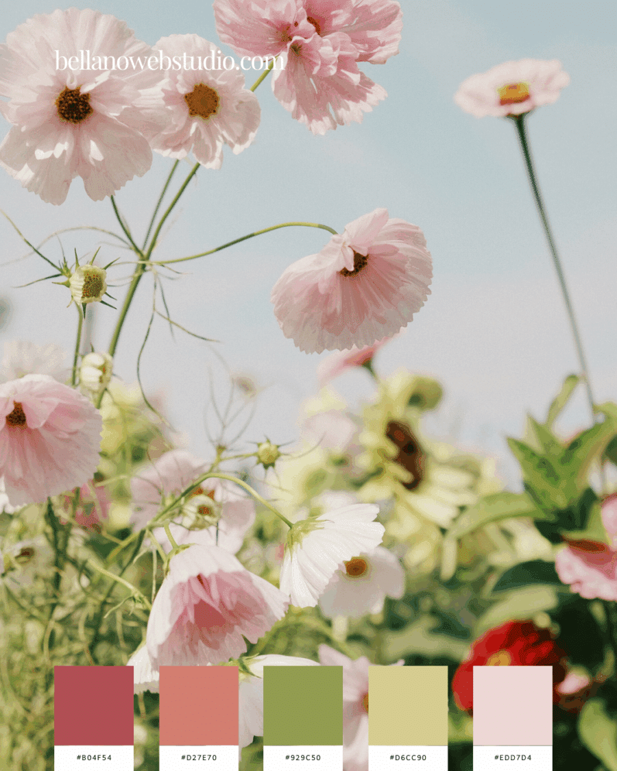
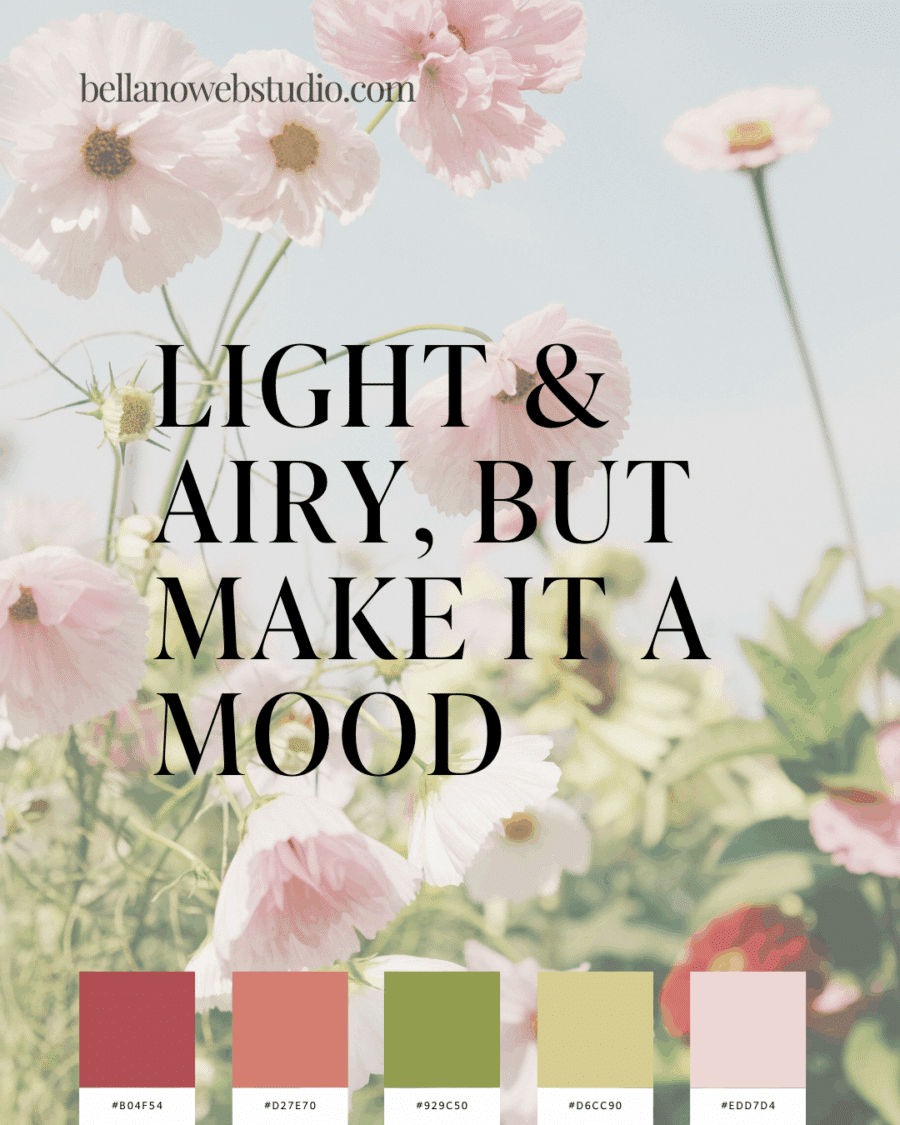
Blooming Air
Garden pinks and fresh greens—a whimsical, airy palette made for dreamers.
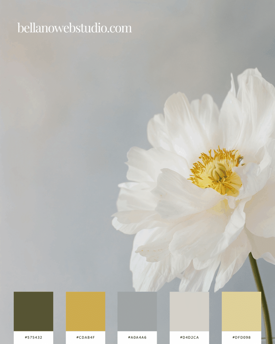
Crisp White & Golden Glow
A mix of soft neutrals with golden highlights—sun-kissed, minimal, and full of warmth.
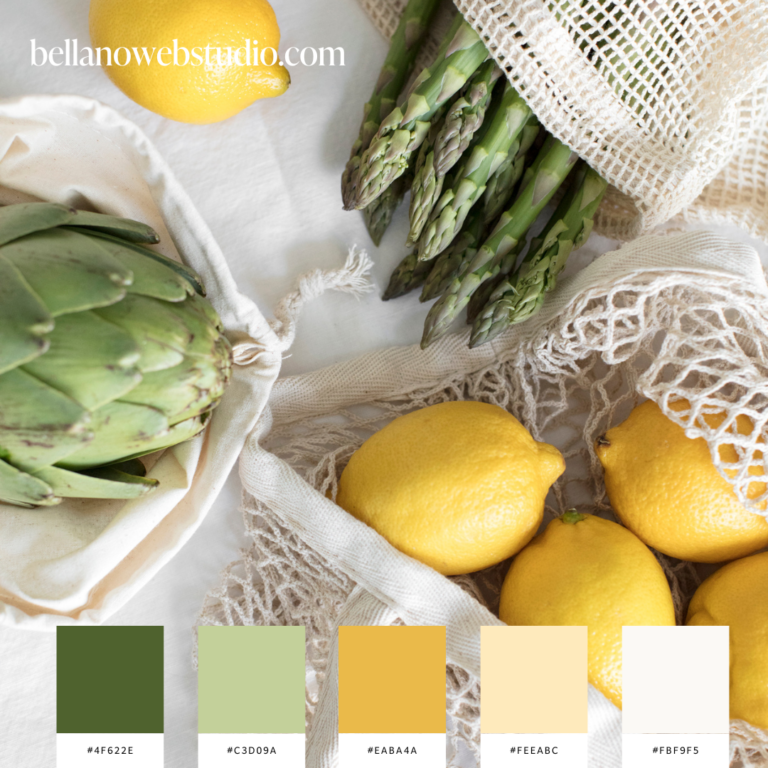
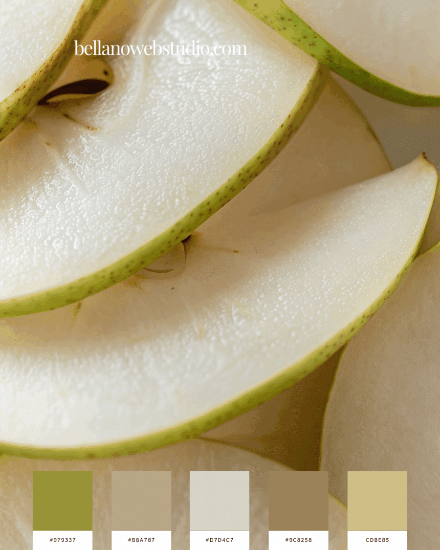
Fresh Pear Tones
Clean greens with natural neutrals that feel grounded and organic, like a slice of summer fruit.
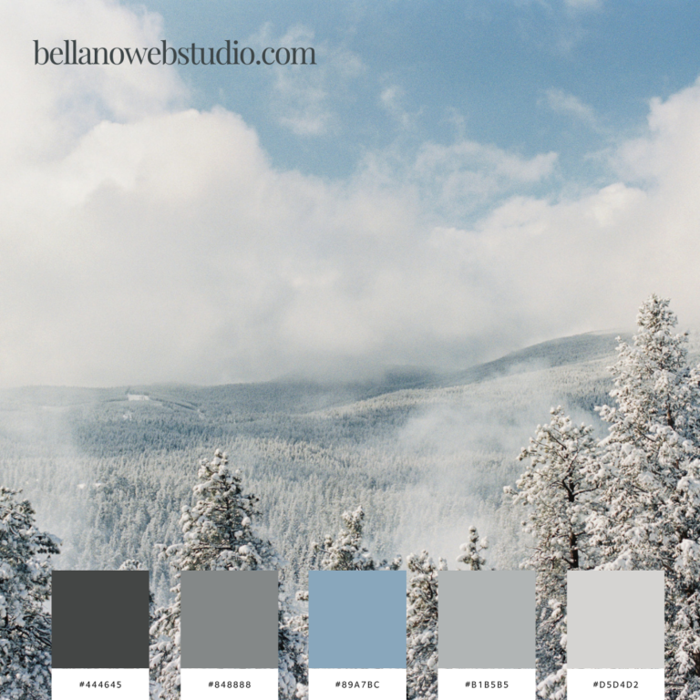
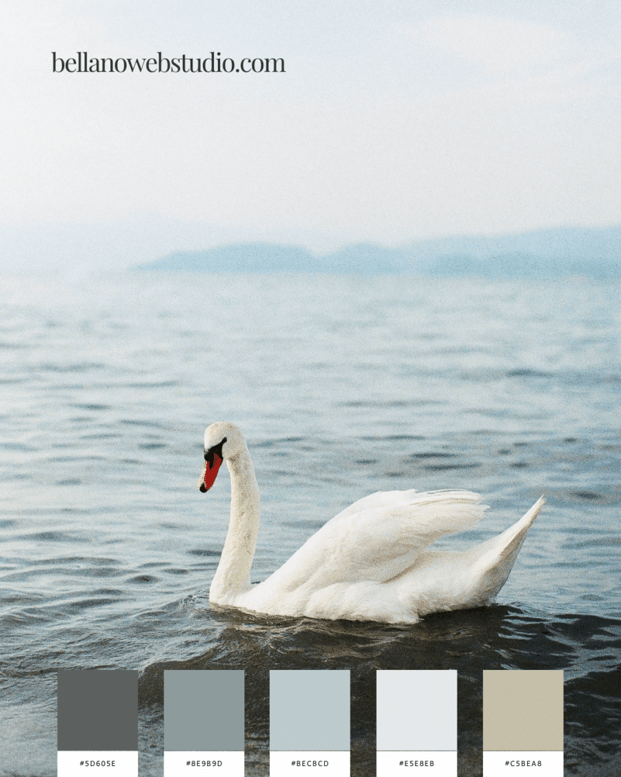
Swan by the Water
Cool grays and serene blues that bring peace, balance, and elegance.
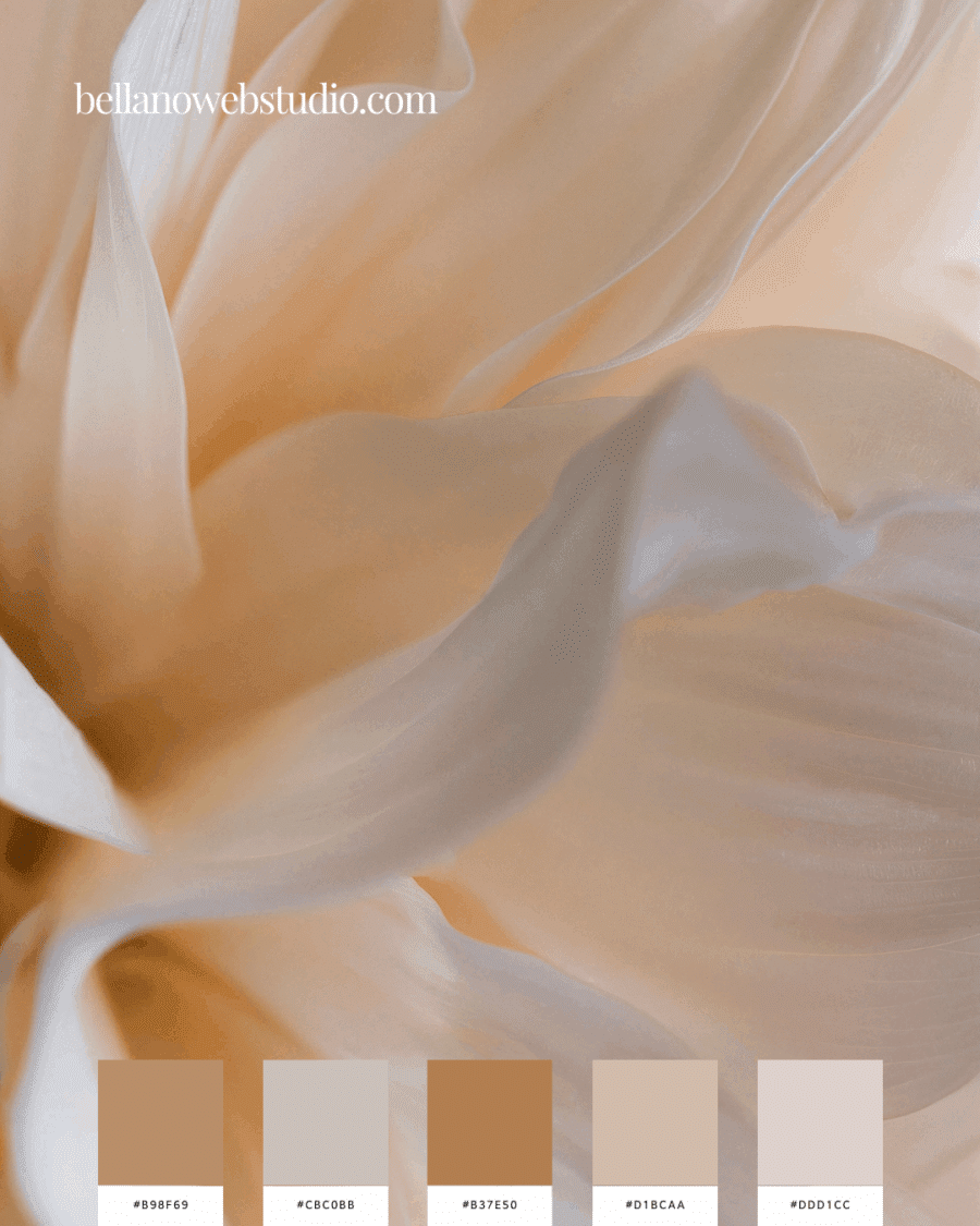
Peachy Petals
A dreamy blush-meets-beige combination—timeless, feminine, and romantic.
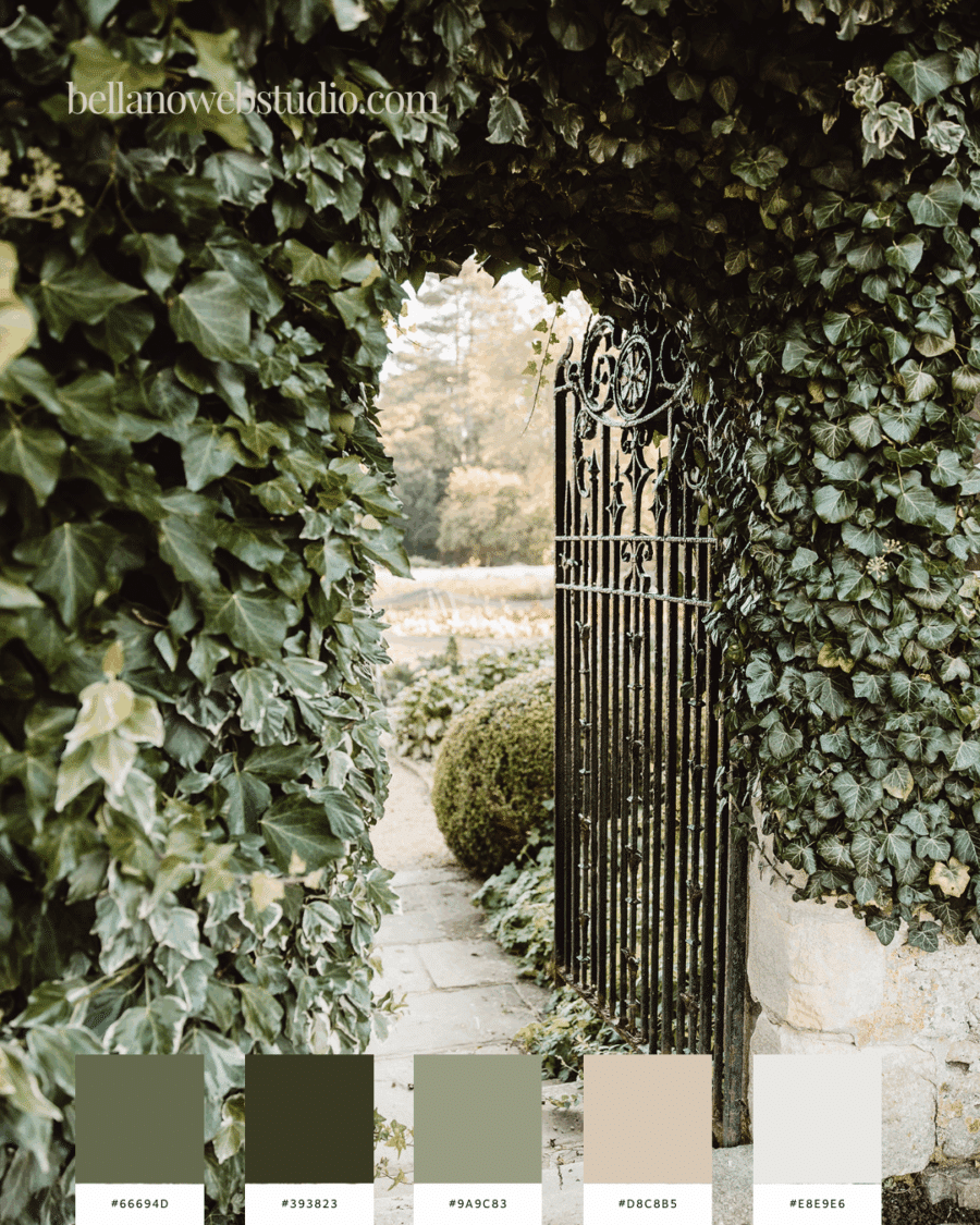
Secret Garden Greens
Earthy ivy tones and stone neutrals—like wandering through a garden gate into calm.
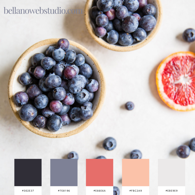
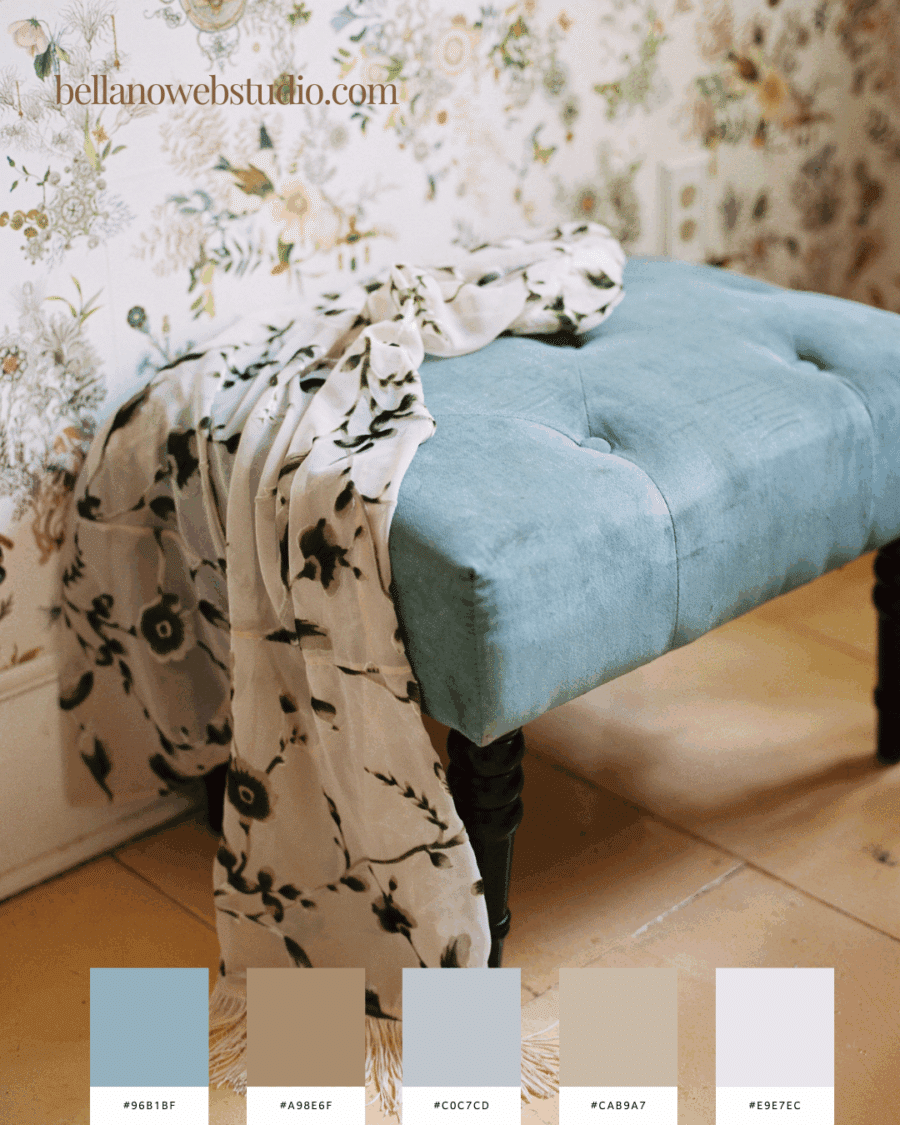
Blue Velvet & Botanical Notes
Sophisticated teal balanced with neutrals—light and airy with just enough depth.
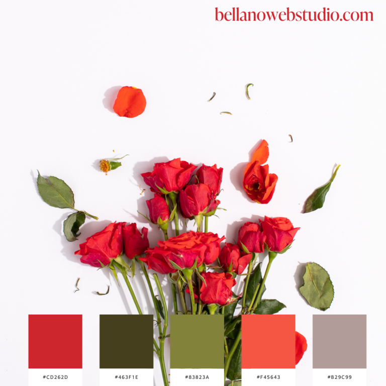
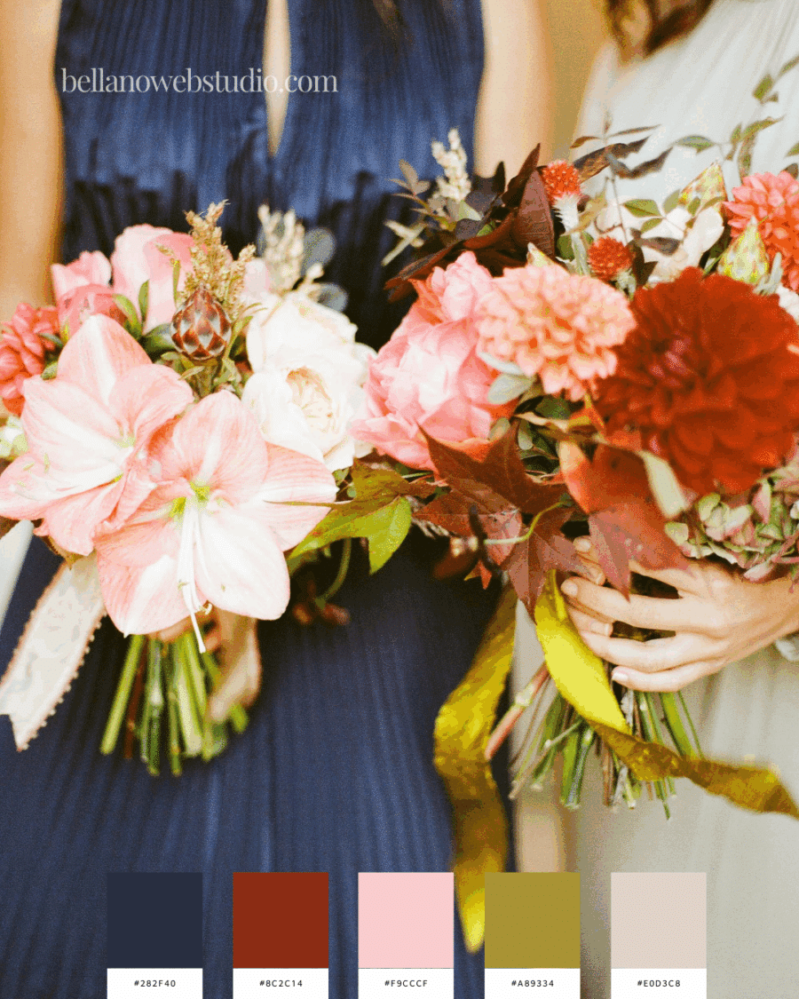
Bouquet Brilliance
Bright florals paired with deep navy—playful, bold, and a little unexpected.
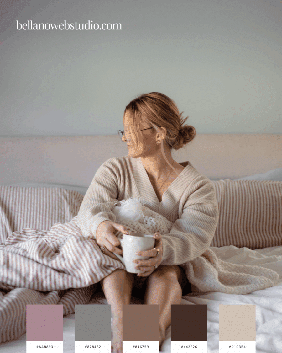
Cozy Neutrals
Warm taupes, blush, and earthy notes—a comforting palette that feels like home.
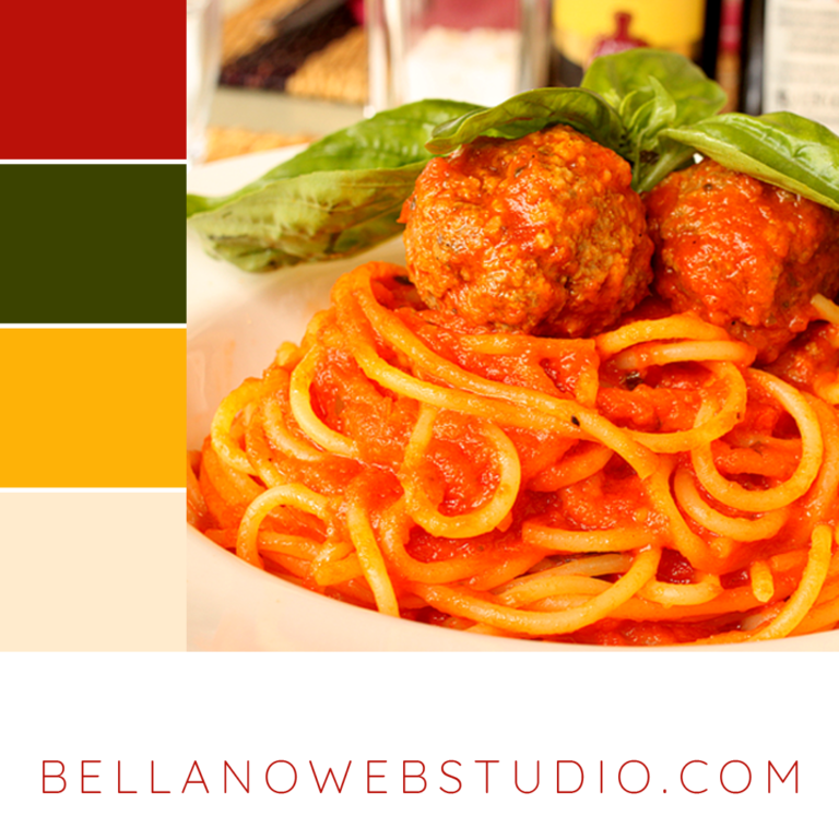
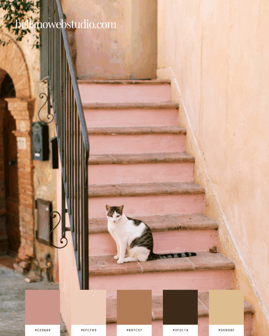
Tuscan Sun & Blush
Muted peach and golden tones—a soft glow that feels both vintage and modern.
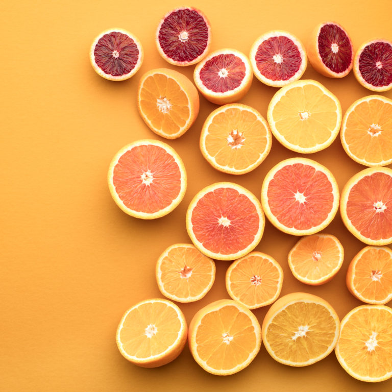
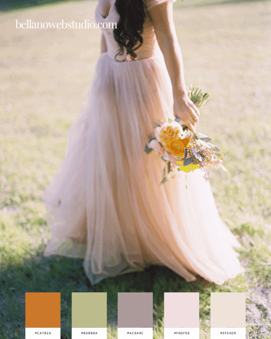
Peach Meadow Glow
Soft peach and blush tones paired with muted greens and warm neutrals—like golden hour in a summer field. Romantic, fresh, and effortlessly dreamy.
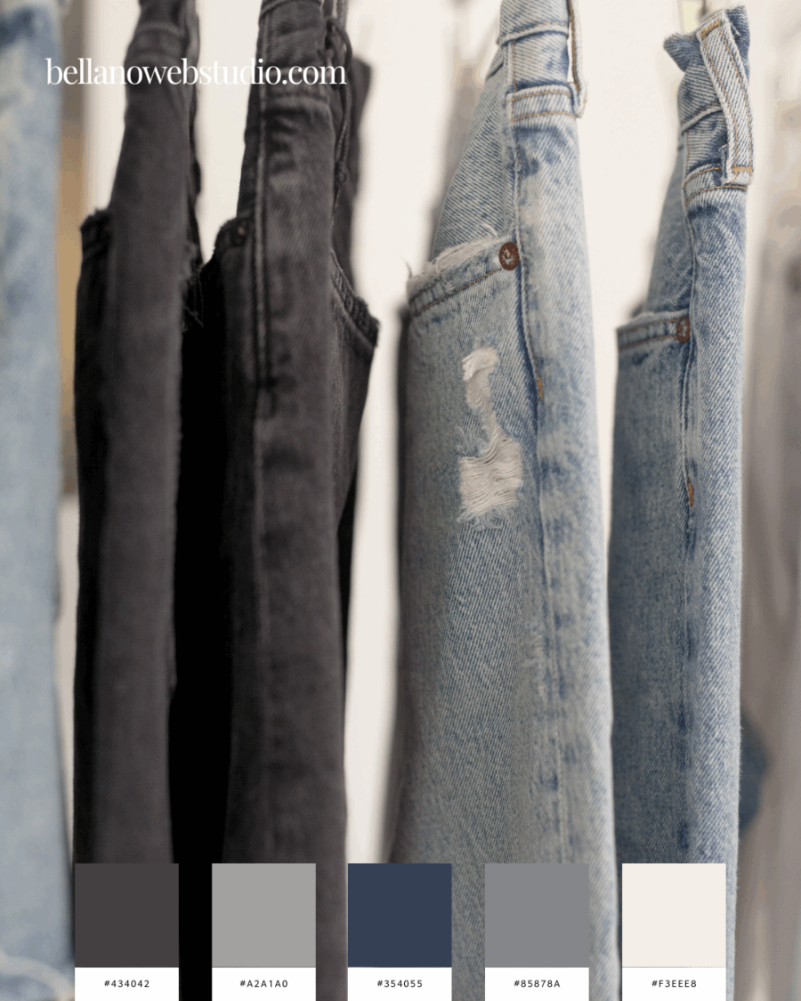
Denim Neutrals
A modern mix of charcoal, slate, and washed denim blues with crisp neutrals—casual, versatile, and timeless, just like your favorite pair of jeans.
How to Use These Palettes
- Branding – Choose 2–3 core shades for consistency, then let accents bring in flexibility.
- Web Design – Keep the lighter tones as backgrounds and use deeper shades for text, accents, or CTAs.
- Content Creation – These palettes translate beautifully into social media graphics, printables, and styled photos.
Final Thought
Colors aren’t just design choices, they’re storytelling tools. With this collection of Light & Airy, but Make it a Mood color palettes, you can bring softness, freshness, and inspiration into every project.
So tell me—which palette speaks to your mood today?
Did you find this post helpful?
Share the love and save it to Pinterest!