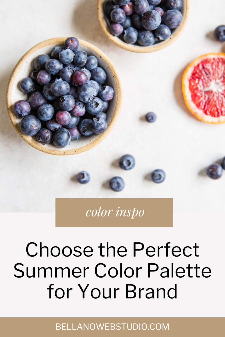
Choose the Perfect Summer Color Palette for Your Brand
With the summer season upon us, it’s a great time to infuse some vibrant and refreshing colors into your brand. The right color palette can convey your brand’s personality, evoke emotions, and leave a lasting impression on your audience. But with so many options to choose from, how do you find the perfect summer color palette that aligns with your brand’s identity?
Look no further! Below are 8 summer color palettes to inspire you this summer and practical tips to help you create a visually stunning and cohesive color palette. Whether you’re a fashionista, a content creator, a travel agency, or a wellness brand, get ready to make a splash this summer with a color palette that truly speaks to your target audience. Let’s dive in and unleash the power of color!
Why consider a summer color palette for your brand
A summer color palette is more than just a collection of pretty colors. It plays a vital role in shaping your brand’s identity and creating a memorable visual experience for your audience. Colors have the power to evoke emotions, influence perceptions, and even trigger actions. By strategically choosing the right colors for your brand, you can create a strong connection with your target audience and differentiate yourself from your competitors.
01
Personality
A summer color palette can help convey the personality of your brand. If your brand is lively and energetic, you might opt for bold and vibrant colors like hot pink or sunshine yellow. On the other hand, if your brand is more sophisticated and elegant, softer and pastel shades might be more suitable. By aligning your color palette with your brand’s personality, you can create a cohesive and authentic visual identity that resonates with your audience.
02
Emotion
A summer color palette can evoke specific emotions and create a positive association with your brand. For example, using cool blues and greens can create a sense of calm and relaxation, perfect for a wellness brand or a travel agency promoting beach vacations. On the other hand, using warm and energetic colors like oranges and yellows can create a sense of excitement and enthusiasm, ideal for a brand targeting adrenaline junkies or outdoor enthusiasts. Consider the emotions you want your brand to evoke and choose colors that align with those feelings.
03
Recognition
A summer color palette can help create a memorable and recognizable brand image. Consistency is key when it comes to branding, and having a consistent color palette across all your marketing channels can help establish a strong brand identity. When your audience sees your brand’s colors, they should immediately associate them with your brand and the values it represents. This recognition can lead to increased brand loyalty and trust.
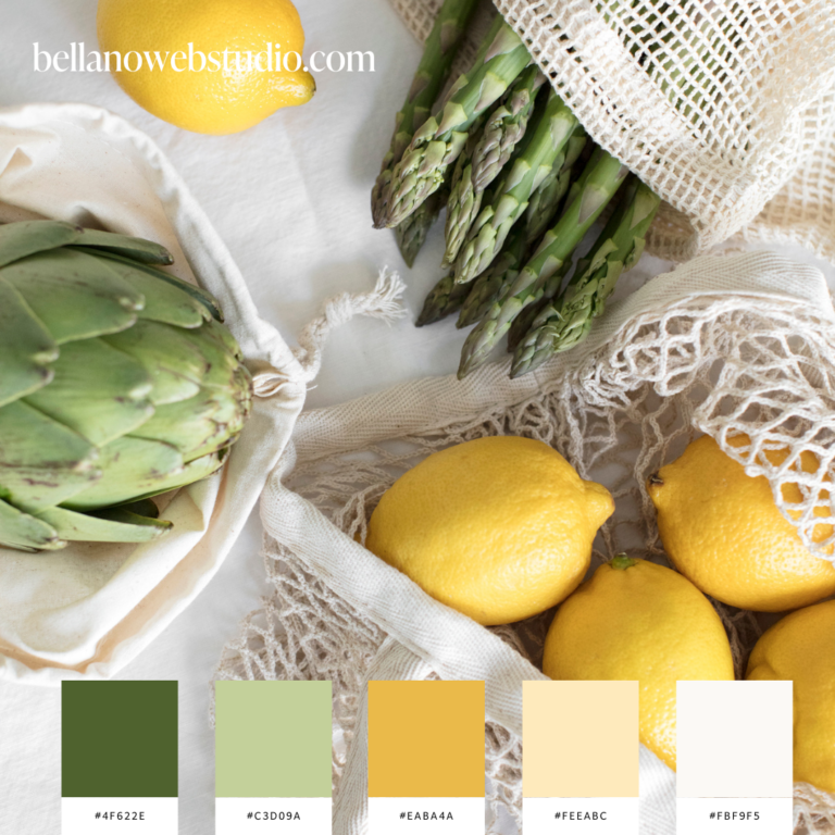
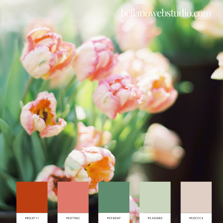
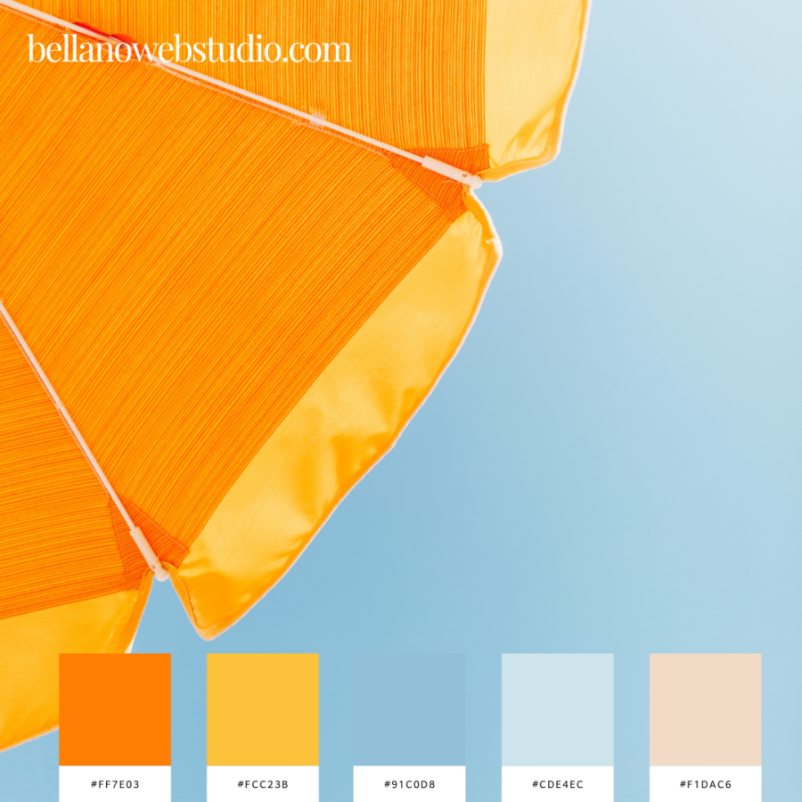
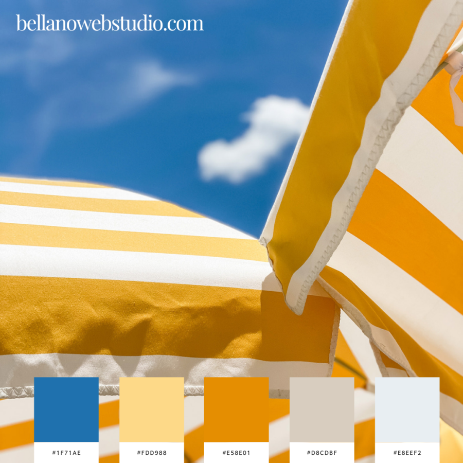
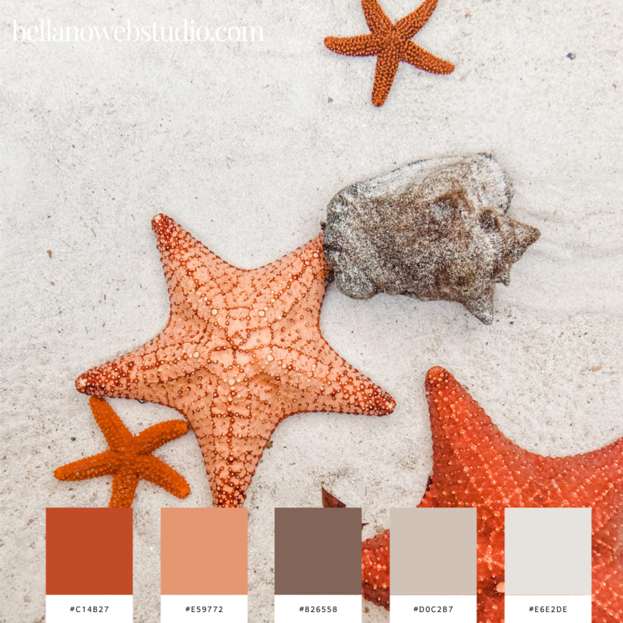
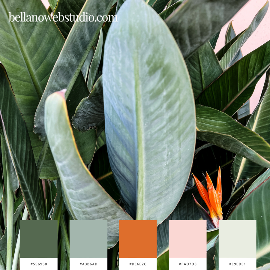
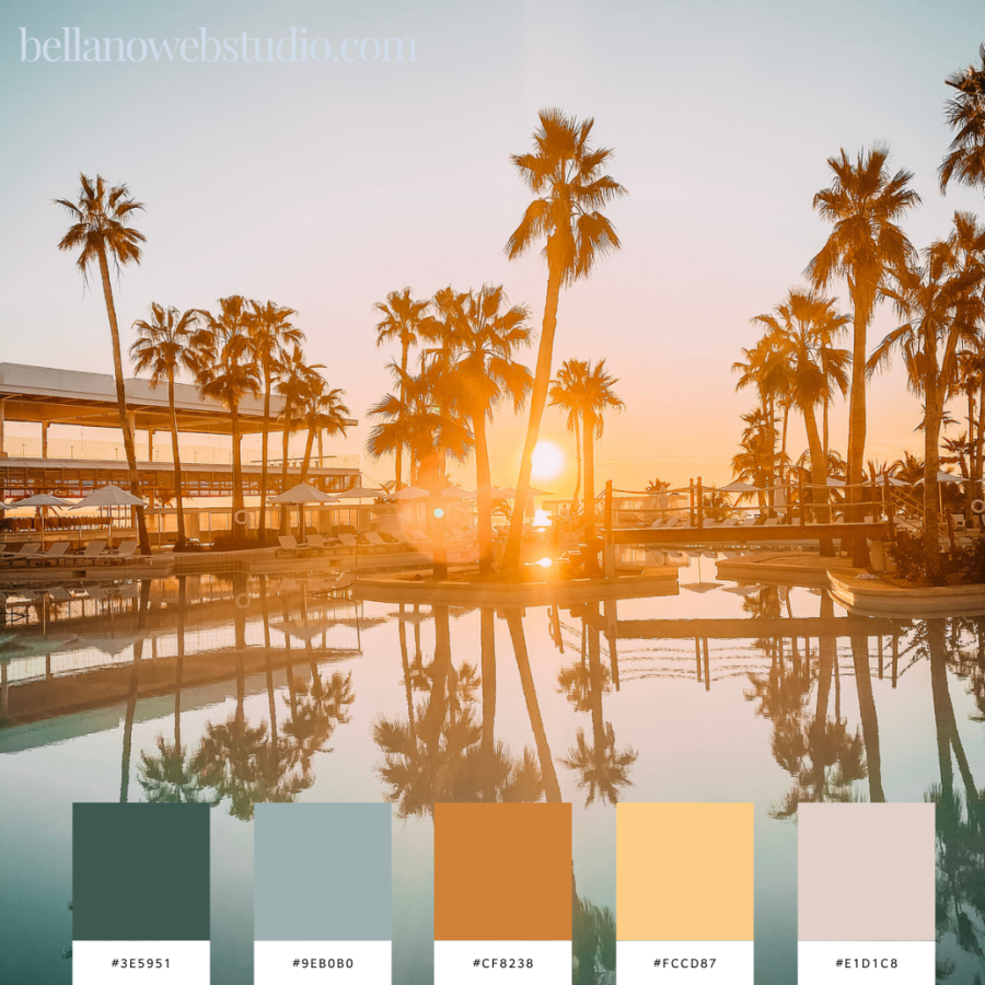
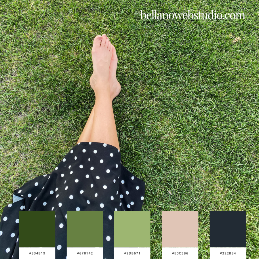
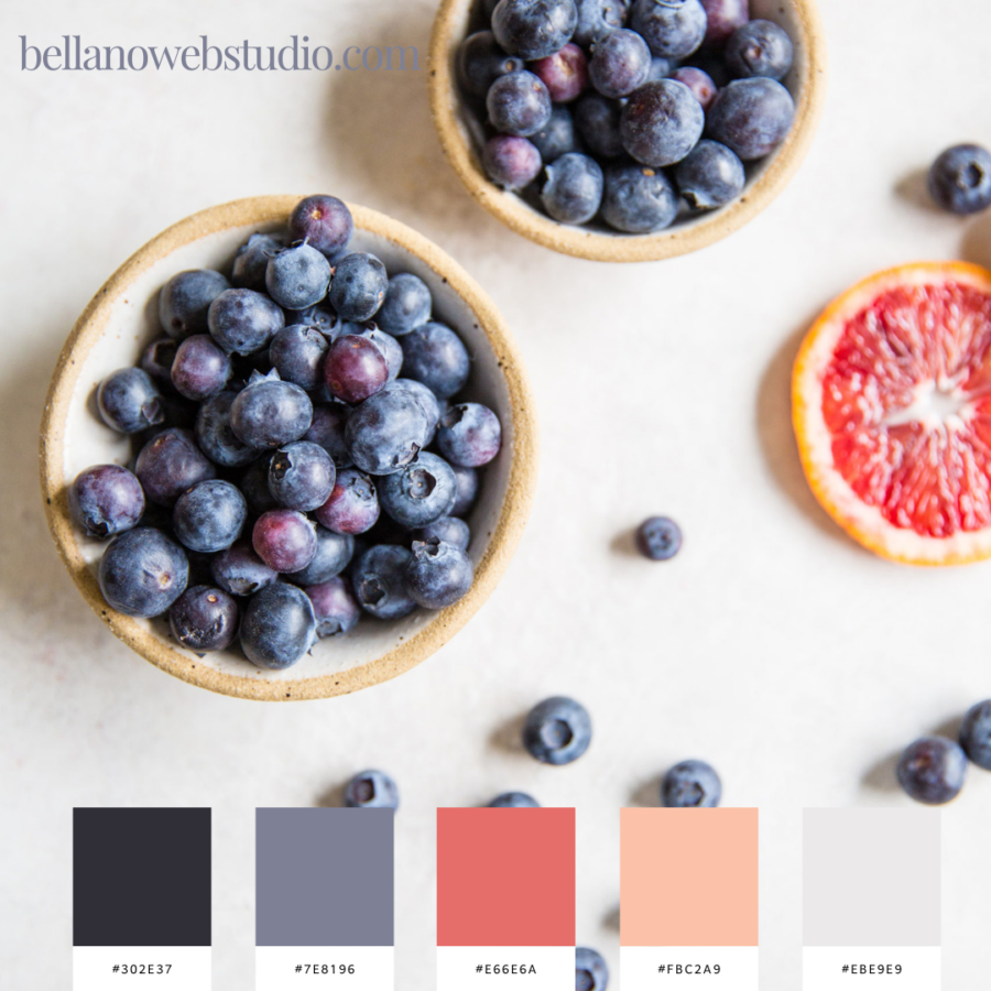
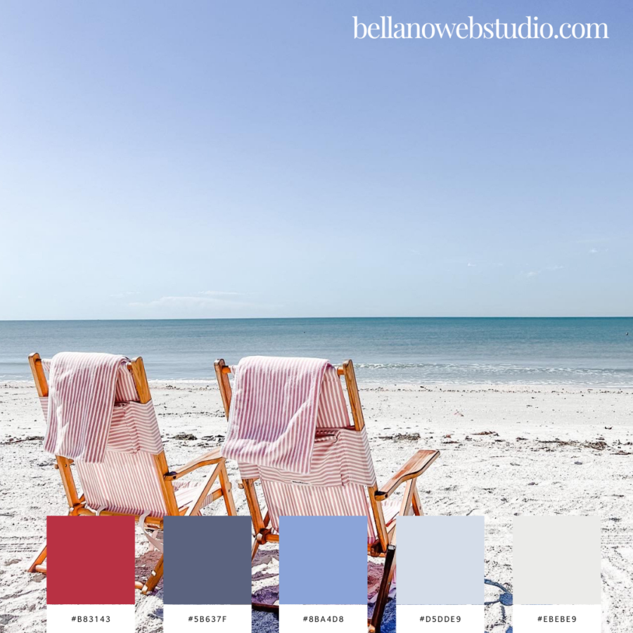
Summer color palettes to inspire you
I love Summer. Spring is my favorite season but Summer is a very close second. The mountains are still green and beautiful but soon they will turn to a golden shade. I’m dreaming of the beach and counting down the days until we head off on vacation for two weeks. If you have any recommendations for the Central California Coast along Highway 1 let me know.
To celebrate Summer I created some color palettes that I hope you will enjoy. I had fun making them. All the images are from Élevae Visuals (one of my favorite places for stock photos).
Pin the ones you love for later.
Find more color palette inspiration here.
Understanding color psychology and its impact on branding
Color psychology is the study of how colors affect human behavior and emotions. Different colors have different meanings and can evoke specific emotions and reactions. Understanding color psychology is crucial when choosing a summer color palette for your brand, as it allows you to communicate the right message and connect with your target audience on a deeper level.
Let’s take a closer look at some commonly used colors and their psychological effects:
These are just a few examples, and each color has its own unique psychological impact. When choosing colors for your summer color palette, consider how they align with your brand’s personality and the emotions you want to evoke in your audience.
Tips for creating a cohesive summer color palette
Creating a cohesive summer color palette involves more than randomly selecting a few colors. It requires careful consideration and a strategic approach. Here are some tips to help you create a visually stunning and cohesive color palette for your brand:
- Start with a base color: Choose one or two primary colors that represent your brand’s identity and values. These colors will serve as the foundation of your palette and should be used consistently across your branding materials.
- Build a complementary palette: Once you have your base color(s), select complementary colors that work well together. These colors can be used for secondary elements, such as buttons, accents, or backgrounds. Look for colors that create visual harmony and balance with your base color(s).
- Consider color variations: To add depth and versatility to your palette, consider including different shades and tints of your chosen colors. Lighter shades can be used for backgrounds or subtle accents, while darker shades can be used for text or more prominent elements.
- Experiment with color combinations: Play around with different color combinations to find the ones that work best for your brand. Use color theory principles, such as complementary, analogous, or triadic color schemes, to create visual interest and harmony. Don’t be afraid to think outside the box and try unexpected combinations.
- Balance warm and cool tones: Consider incorporating a mix of warm and cool colors in your palette. This balance can create a dynamic and visually appealing composition. Warm colors can grab attention and evoke energy, while cool colors can create a sense of calmness and balance.
- Test your palette in different contexts: Ensure that your color palette works well in various contexts and across different marketing channels. Test it on different devices, backgrounds, and materials to ensure legibility and visual appeal. Make adjustments as needed.
Creating a cohesive summer color palette takes time and experimentation. Don’t rush the process and be open to refining and adjusting your choices until you achieve the desired result. You can choose a summer color palette that not only looks visually appealing but also aligns with your brand’s identity and connects with your target audience. Just like fashion and design, color trends also come and go. Staying up to date with the latest color trends can help give your brand a fresh and modern look.
Now that you’ve chosen your perfect summer color palette don’t forget to implement it consistently across all your marketing channels. And then get out there and enjoy the sunshine.
Are you ready for a website you love?
If you are ready for a redesign or your first website and the thought of figuring it all out makes your heart race a bit and leaves you overwhelmed I got you covered! My specialty is taking your wish list and blending your personality with the functionality you need for an online presence that makes you proud. Let’s create a stunning first impression and a website where you can stand out online.
Don’t forget to PIN this post for later.