How to Make Your Text More Readable
Easy to read, easy to love.

Improving text legibility is crucial for keeping your audience engaged. If your text is hard to read, visitors will quickly lose interest. Clear, readable text ensures your message is effectively communicated and keeps your audience on your site longer.
Let’s dive into some practical tips on how to make text more readable.
Why Legibility Matters
Clear text improves user experience and ensures your valuable information is understood. Plus, it boosts your SEO and keeps visitors on your site longer. Win-win!
Choose the Right Font
Fonts are like the outfit for your words. Choose clean, simple fonts. Two of my favorites for body text are Lato and Open Sans. They’re modern and easy to read on any screen size. Selecting the right font is crucial for learning how to make text more readable.
Pro Tip: Avoid overly decorative fonts for body text. They might look pretty but can be hard to read, especially on smaller screens.
Size Up Your Text
Size really does matter when it comes to text. If your font is too small, people will struggle to read it. Aim for at least 16-18px for your main text. Headings should be larger to create a clear hierarchy and guide your readers through your content. Learning how to make text more readable involves ensuring your text size is appropriate.
Pro Tip: Ensure your text is legible on smaller screens by testing it on various devices.
High Contrast is Key
High contrast between your text and background is essential for readability. Black text on a white background is the gold standard, but other high-contrast combinations work well too. Understanding contrast is a vital part of knowing how to make text more readable.
Pro Tip: Use a contrast checker tool to ensure your text and background colors meet accessibility standards.
Spacing is Essential
Good spacing can make your text breathe and improve readability. Pay attention to line height (the space between lines of text) and letter spacing (the space between letters). Aim for a line height of at least 1.3 to 1.5 to give your text enough room to be easily read. Spacing adjustments are key in how to make text more readable.
Pro Tip: Use ample white space around your text blocks to avoid clutter and create a clean, inviting look.
Limit Text Length
Break up your text into shorter paragraphs to make it more digestible. Aim for no more than 50-60 characters per line. This keeps your content approachable and prevents your readers from feeling overwhelmed. Concise text length is a fundamental aspect of how to make text more readable.
Pro Tip: Use bullet points and numbered lists to break up text and highlight key points.
Use Text Hierarchy
Text hierarchy is like a map for your readers. It helps them navigate through your content and find what’s important. Use headings, subheadings, and bullet points to organize your content. This improves readability and makes your content more scannable. Text hierarchy effectively is essential to make text more readable.
Pro Tip: Use bold and italics sparingly to emphasize important points without overloading your readers.
Test on Different Devices
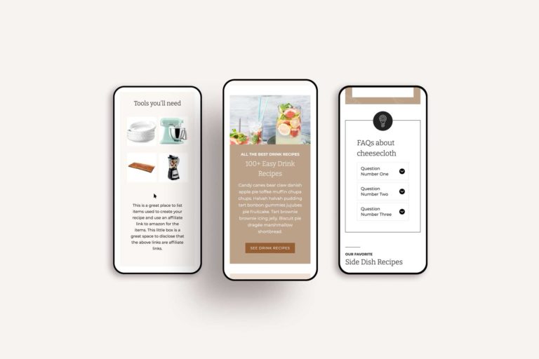
What looks great on your desktop might not translate well to a mobile screen. Always test your text on different devices to ensure it’s legible everywhere. This is crucial, especially since so many people browse the web on their phones. Don’t make your readers do the dreaded pinch and zoom.
Pro Tip: Use responsive design principles to ensure your text adjusts beautifully across all devices.
Align Your Text Correctly
Alignment can significantly impact readability. Here’s when to use left or center alignment:
Left Align: This is the most common and easiest-to-read alignment. It creates a straight line on the left side, which our eyes naturally follow. Use left alignment for body text, paragraphs, and most web content.
Center Align: Best reserved for headings, short lines of text, and calls to action. Center alignment is harder to read in large blocks, as it disrupts the natural flow of reading. Use it sparingly to highlight important information without compromising readability.
Avoid: Right alignment and justified text for body content. Right alignment creates a ragged left edge, making it hard to follow, and justified text can create uneven spacing, which disrupts readability.
Pro Tip: If your sales copy is in your paragraph font and longer than a headline switch to left align. Centered copy tricks the eye into skimming and expecting shorter lines. You don’t want readers to miss those juicy details.
Accessibility Matters
Making your text accessible is not just good practice; it’s essential. Use alt text for images so screen readers can describe them to visually impaired users. Ensure your site meets accessibility standards to create an inclusive experience for all visitors. Accessibility is a key consideration in how to make text more readable.
Pro Tip: Regularly audit your site for accessibility issues and fix them promptly.
Your Text, Transformed!
By following these tips, you’ll transform your text from drab to fab. Your words will shine, your message will be clear, and your readers will thank you. Remember, the key to great text is readability!
Did you find this post helpful?
Share the love and save it to Pinterest!


Ready to take your website to the next level?
At Bellano Web Studio, I specialize in creating stunning websites that stand out from the sea of sameness. Whether you need a complete site overhaul or just a few tweaks, I’m here to help. Let’s chat about how to make your content sparkle!


