Exploring 12 Navy Blue Color Palettes to Love
Have you ever been on a quest for the perfect color? That’s exactly what happened to me the other day while I was working on a Branding Solution project. I set out in search of the perfect navy blue, a color that speaks of the deep ocean and the vast night sky. I started by googling navy blue color palettes and didn’t find any that spoke to me.
Creating color palettes is one of my favorite things, I love photography and I love color so it’s fun and stress-free. I headed over to Élevae to make the most of my stock photo membership and searched for images featuring dark blue. Searching the gallery is oh so easy and what I found was much more than just a single shade…it was a whole vibe.
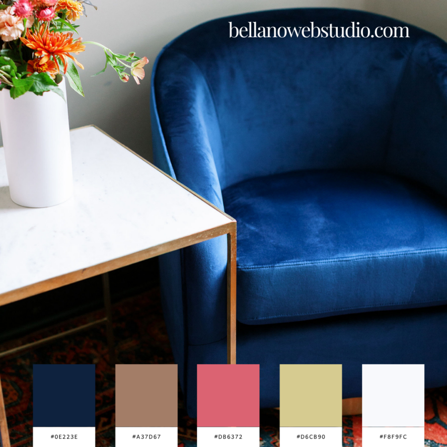
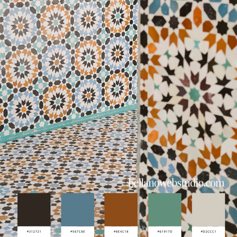
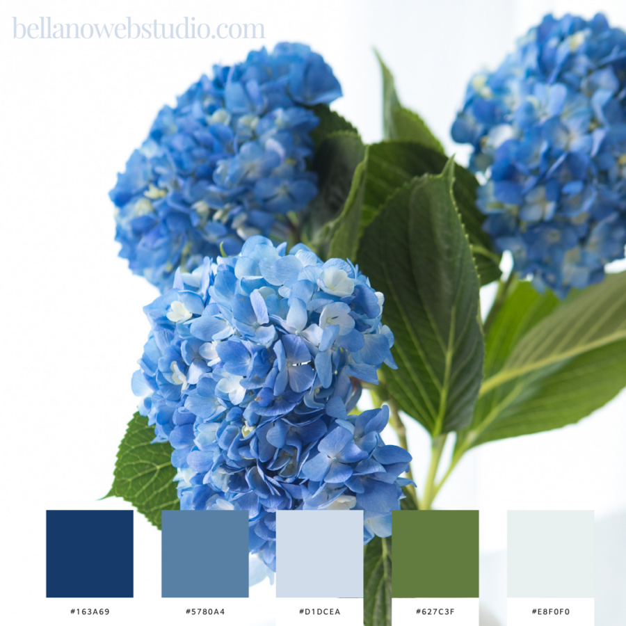
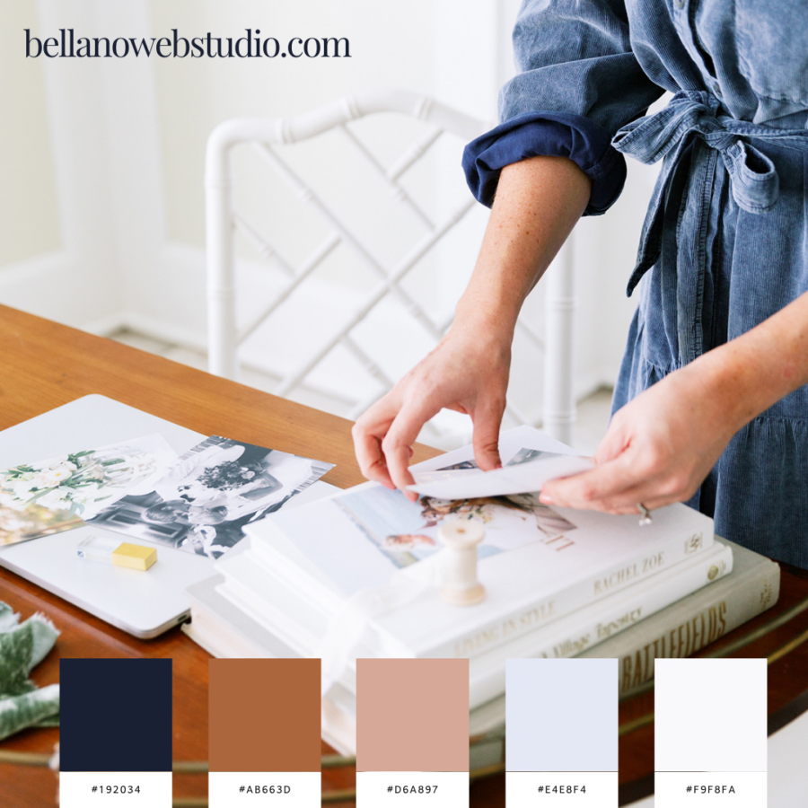
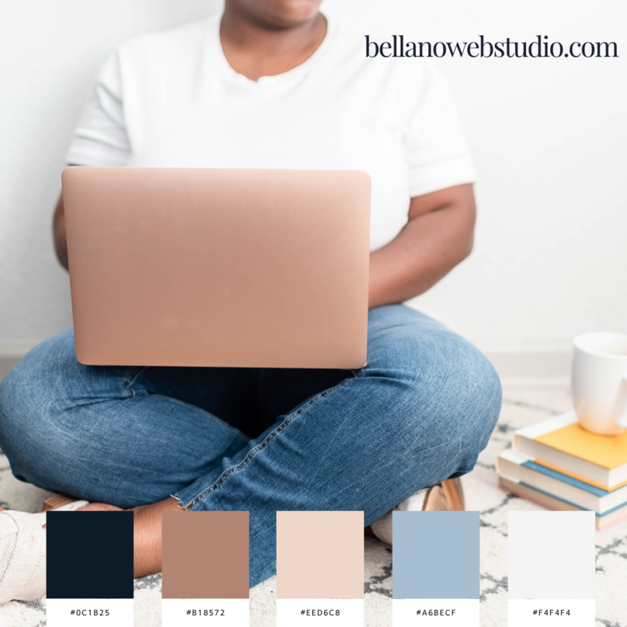
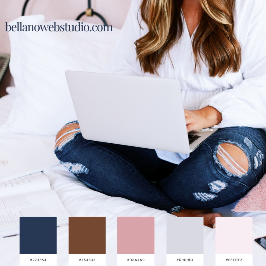
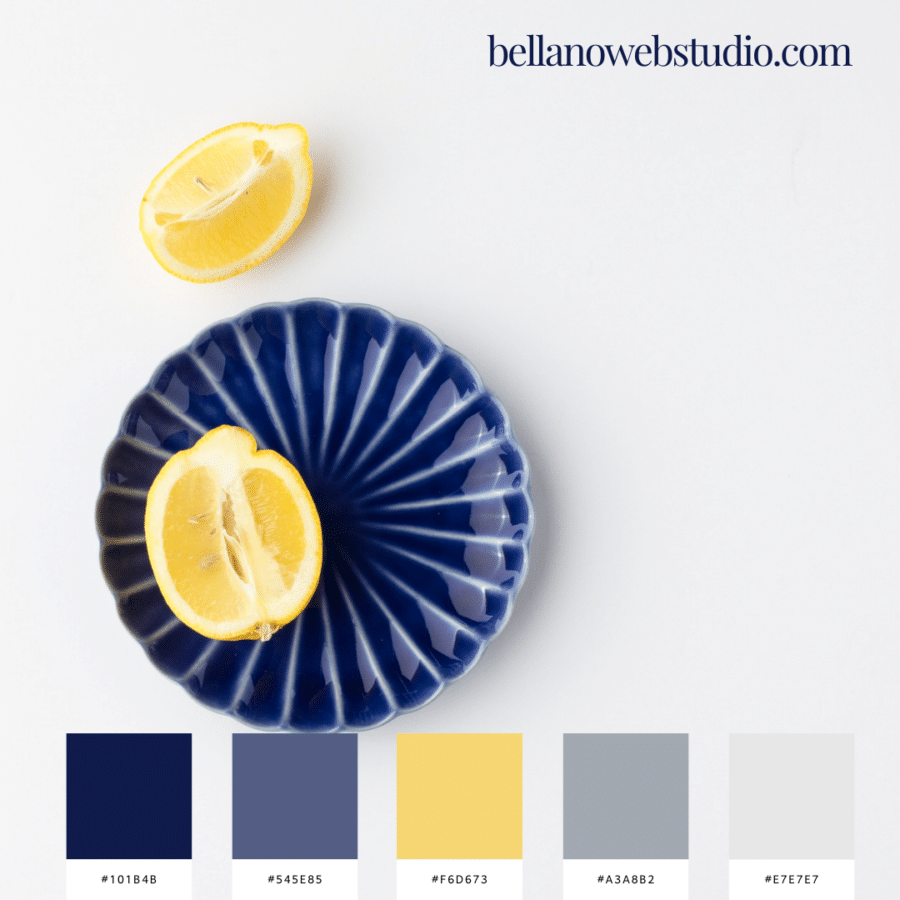
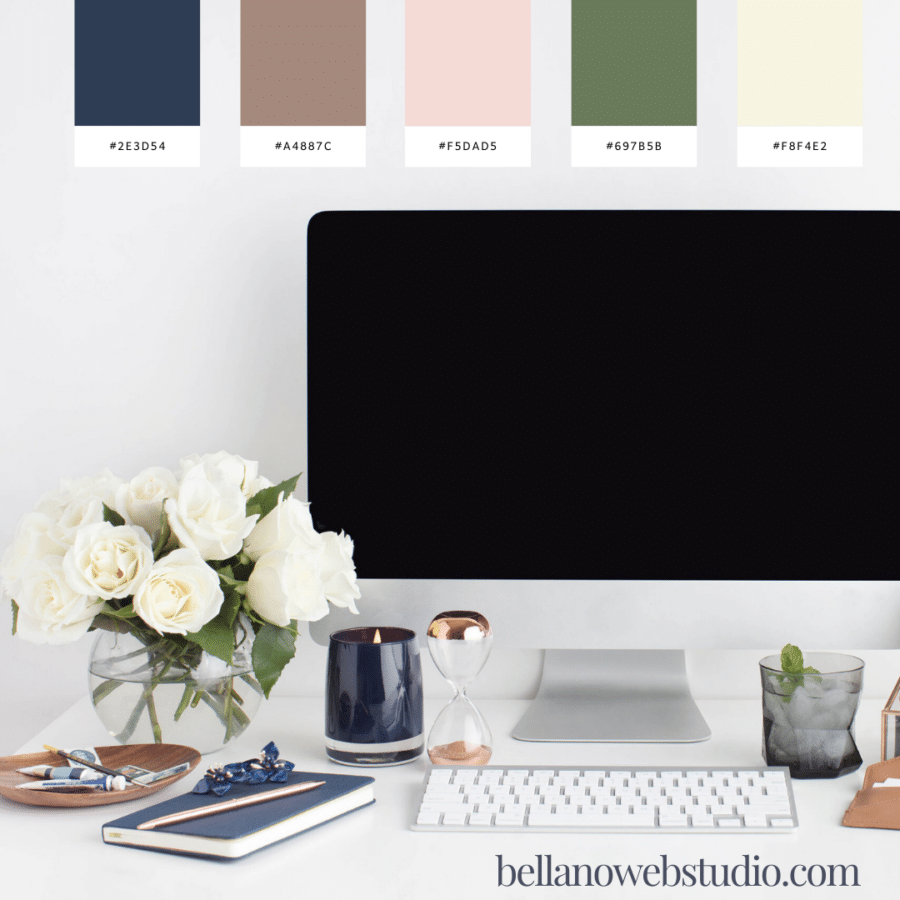
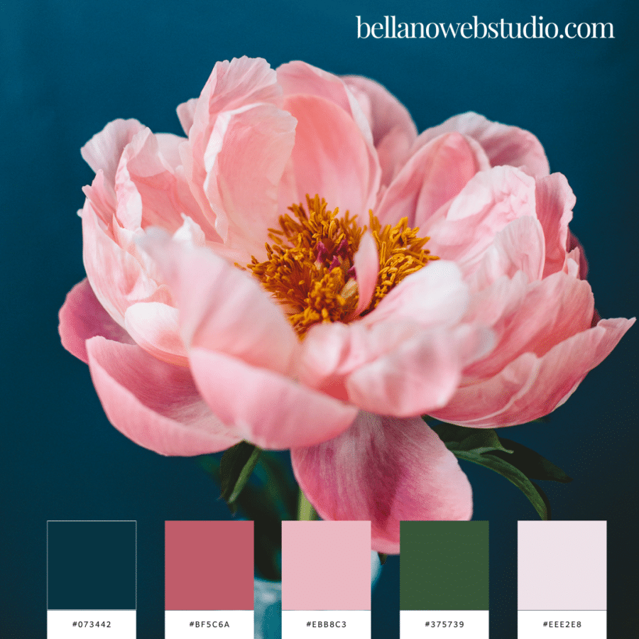
I ended up creating not one, but twelve beautiful color palettes featuring navy blue. Each one weaves a unique story of color and emotion.
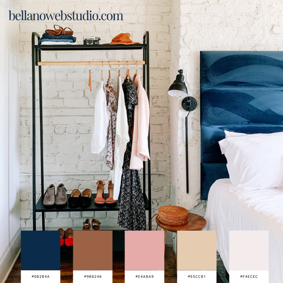
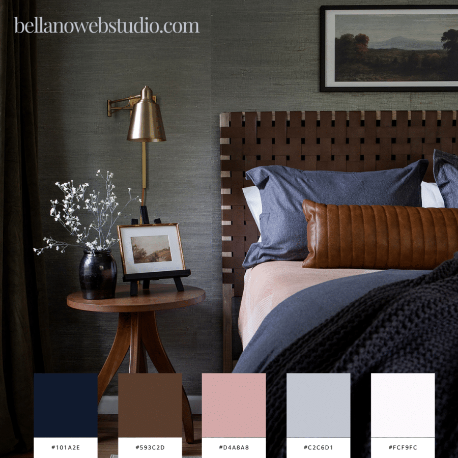
I wanted to share with you these stunning schemes that beautifully combine the elegance of navy blues with the earthy tones of browns and the soft allure of rosy pinks. These aren’t just colors; they’re narratives, moods, and sources of inspiration. From the tranquil navy that whispers of serene midnight skies to the comforting browns that evoke autumnal warmth, each palette is a gateway to a unique world of design possibilities.
Let’s explore how each of these palettes can inspire your next project, whether it’s cozy interior decorating, sophisticated brand design, or something uniquely personal. If you see one (or several) you love make sure you pin them for later.
Navy Blue: The Anchor of Sophistication
Navy blue is more than just a color; it’s a statement. It embodies sophistication, depth, and stability. In color psychology, navy blue represents knowledge, power, and integrity. It’s an ideal choice for corporate branding, as it conveys professionalism and trustworthiness. In interior design, navy blue can create a focal point, lending a room an air of elegance and timelessness. It pairs well with a multitude of colors, acting as a versatile base for many palettes.
When to Use Navy Blue:
- In branding to convey professionalism and reliability.
- As an accent wall in interiors for a touch of elegance.
- In fashion and textiles for a classic, timeless look.
Brown: Earthy and Reliable
Brown, the color of the earth, signifies reliability, resilience, and safety. It evokes a sense of strength and comfort, making it a great choice for creating a grounding effect in any design. In branding, brown can be used to communicate honesty and dependability, often utilized by organic or nature-based companies. In home decor, it brings warmth and coziness, making spaces feel more inviting and secure.
When to Use Brown:
- In branding for organic, natural products or services.
- In home interiors to create a warm, welcoming environment.
- In apparel and accessories for a natural, down-to-earth feel.
Cream: The Soft Touch of Versatility
Cream is a soft, neutral color that offers a sense of calm and simplicity. It represents cleanliness and purity, often used in design to create a light, airy feel. In branding, cream can be used to convey elegance and understated sophistication. In interiors, it serves as a versatile backdrop, allowing other colors to stand out while contributing to a serene and harmonious environment.
When to Use Cream:
- In minimalist or contemporary brand designs for a clean, sophisticated look.
- As a base color in interior design for a light, spacious feel.
- In fashion for a subtle, elegant touch.
Soft Pink: Gentle and Inviting
Soft pink is a color of compassion and nurturing. It’s gentle, soothing, and often associated with romance and tenderness. In color psychology, soft pink represents kindness and empathy. It’s an excellent choice for brands that want to convey a sense of care and approachability. In interior design, soft pink adds a touch of warmth and softness, creating an inviting and comforting atmosphere.
When to Use Soft Pink:
- In branding for health, wellness, or childcare-related businesses.
- In room decor for a nurturing, tranquil ambiance.
- In apparel and accessories for a touch of femininity and warmth.
Integrating Colors in Design
The key to successfully integrating these colors into your designs lies in understanding their individual qualities and how they interact with each other. Navy blue can serve as a strong base, while brown adds an element of stability and warmth. Cream offers a neutral canvas, allowing other colors to shine, and soft pink brings in a delicate, emotional touch.
Whether you’re designing a brand identity, revamping an interior space, or creating a fashion line, these colors offer endless possibilities. Remember, color is not just about aesthetics; it’s about storytelling and evoking emotions. So, when you choose a palette, think about the story you want to tell and the feelings you wish to evoke.
In the end, the right use of color can make all the difference in creating designs that are not only visually appealing but also deeply resonant with your audience.
More Navy Blue Inspired Color Palettes
Love the photos in this post?
Me too and I LOVE Élevae! The way you show up online is critical to your business growth and ultimate success. They offer business owners high-quality, gorgeous, non-stocky stock photography and video! Élevae is the only styled stock photography membership that includes:
- A catalog of 6,000+ trend-forward, highly curated images.
- The best photographers in the industry contributing to your brand visuals
- A robust keyword search engine so you can quickly locate exactly what you’re looking for.
- The only algorithm in the industry, Custom Curation™, that pulls images to suit your brand based on your color palette, industry, and interests
- Unlimited downloads
- Plus, a bank of hundreds of caption prompts makes it even easier to find ideas for what to post.
Did you fall in love with blue?
Share the love and save it to Pinterest!
