10 Cozy Fall Color Palettes
Fall Color Inspiration: 10 Cozy Palettes to Transform Your Designs
Fall is here, and with it comes the magical shift in colors—those warm, rich hues that make you want to wrap up in a chunky sweater, sip a hot latte, and get lost in the beauty of the season. If you’re feeling the pull to refresh your website, branding, or design project with some autumn vibes, I’ve got 10 stunning fall color palettes to inspire you! Each palette blends warm tones, earthy neutrals, and a dash of whimsy to give your designs that cozy, inviting feel.
Why Fall Colors Work So Well
What makes fall colors so irresistible? For one, they evoke a sense of warmth and comfort. The crisp air, golden leaves, and pumpkin-spiced everything seem to tell us it’s time to slow down and get cozy. Colors like burnt orange, mustard yellow, and deep burgundy are grounding—they remind us of nature’s seasonal transition and invite us to create spaces (or websites!) that feel both welcoming and timeless.
Fall colors are versatile, and that’s what makes them so exciting to use in design. Whether you’re working on a website restyle, refreshing your branding, or dreaming up a new logo, fall colors offer the perfect balance of richness and calm.
Let’s dive into these 10 dreamy fall color palettes!
Citrus Blossom
This vibrant, fresh palette blends natural warmth with earthy tones and soft pastels, creating a perfect balance of energy and elegance. It’s the ideal mix for a project that wants to capture the brightness and beauty of nature with a playful yet refined aesthetic.
- Burnt Orange – #C8602F: This shade brings the warmth of late-summer oranges into fall, adding a rich, bold undertone that feels both lively and grounded.
- Soft Gold – #CCBD68: A gentle gold that evokes the feeling of sunlight filtering through fall leaves, this color is soft yet adds a hint of luxury and brightness.
- Olive Green – #6F7548: This earthy olive shade brings the balance of nature, giving the palette a grounded, organic feel that ties everything together.
- Muted Gray – #78796B: Adding a touch of sophistication, this muted gray works as a calming neutral, allowing the other colors to stand out without overwhelming the design.
- Blush Pink – #F0E5E2: This soft, delicate pink brings a romantic and fresh air to the palette, lightening up the warmer tones for a balanced, elegant finish.
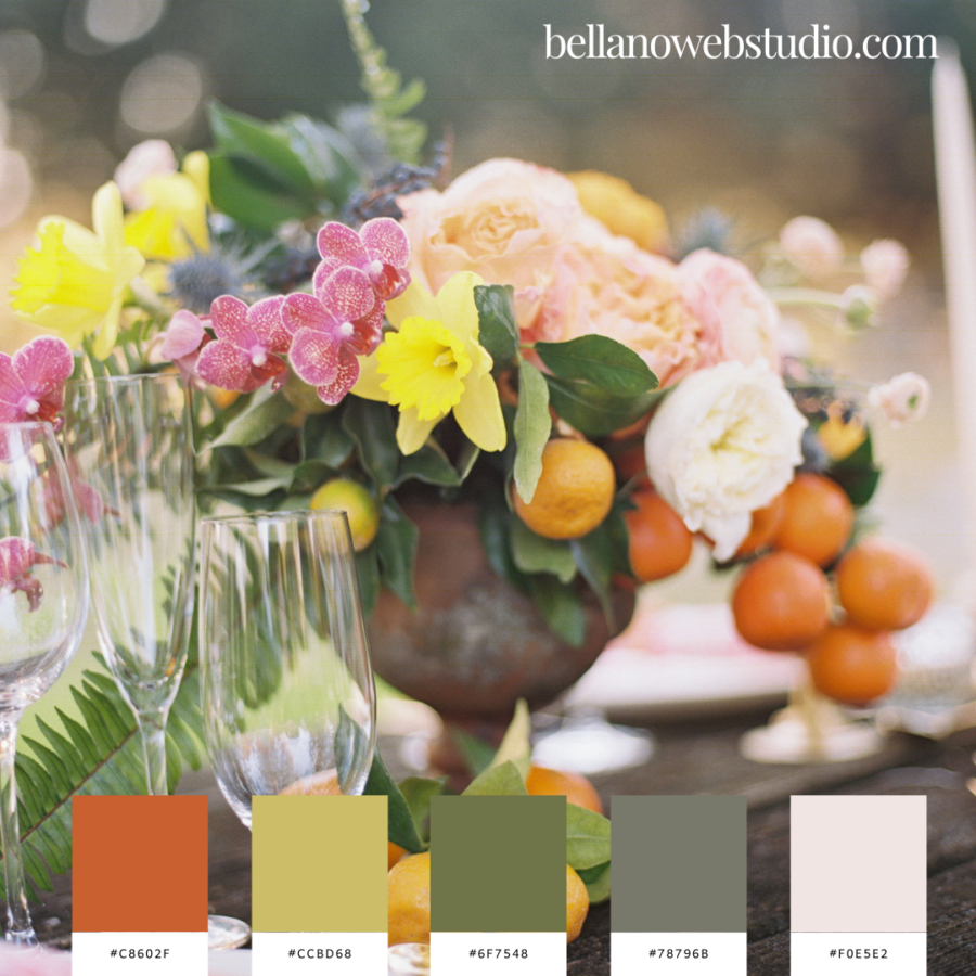
Perfect For:
This palette is great for anyone looking to blend a fresh, organic feel with subtle luxury. Think event planners, florists, lifestyle bloggers, or any creative project needing a harmonious blend of energy and sophistication.
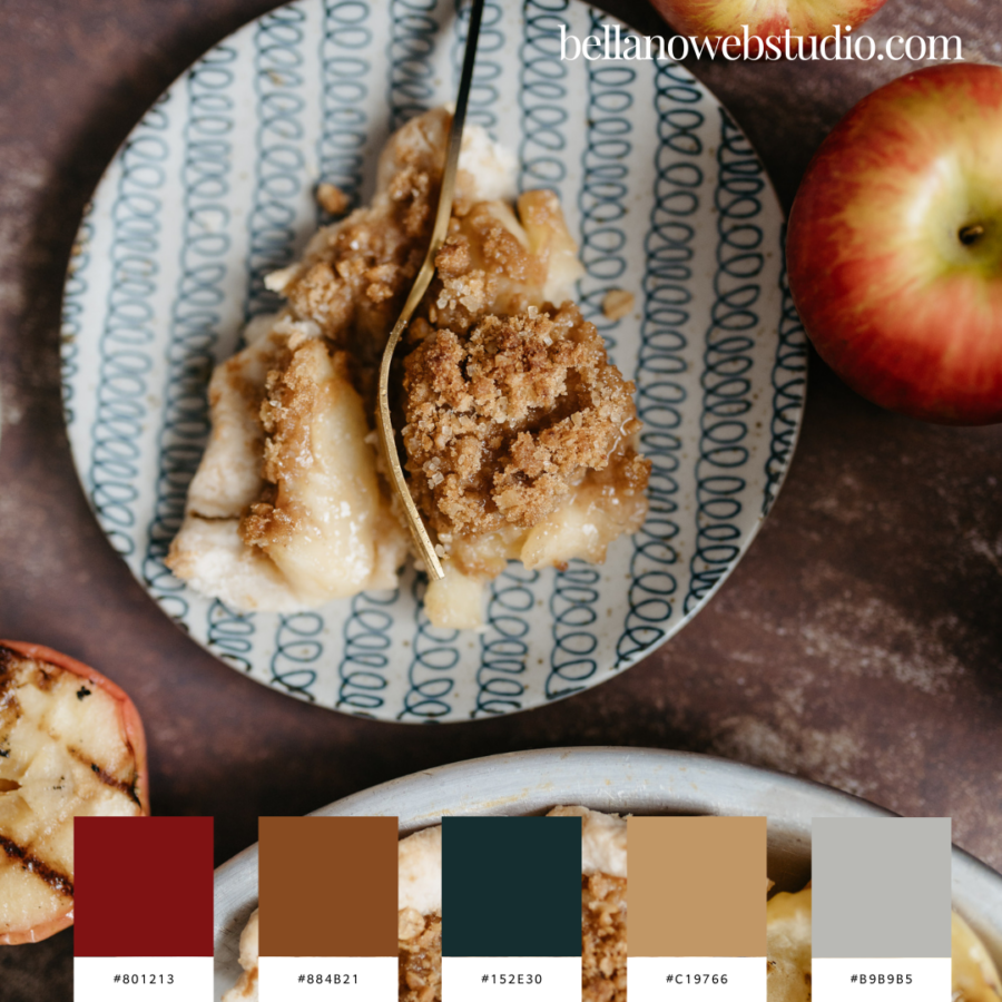
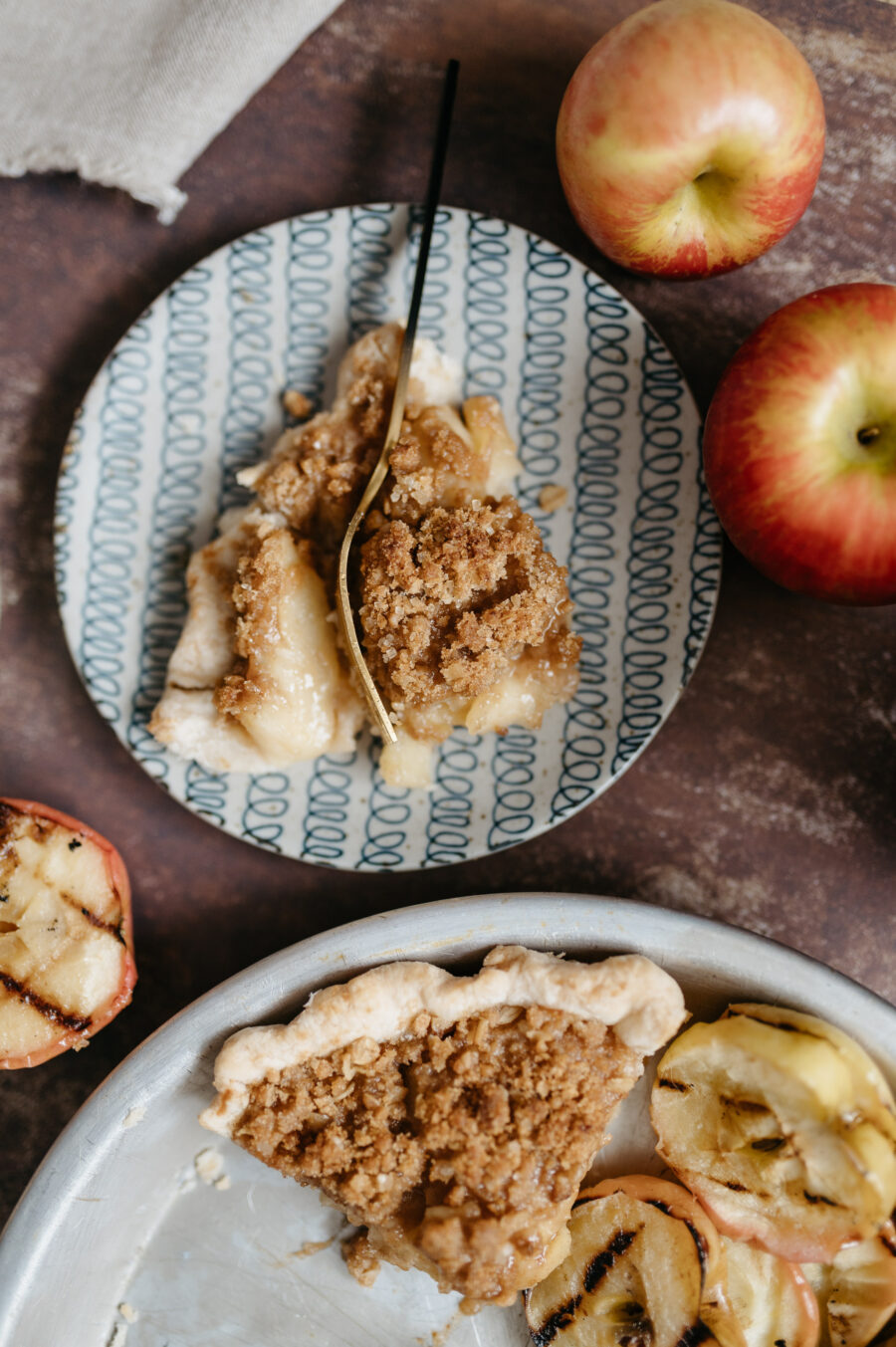
Apple Crumble Comfort
This warm and inviting palette takes its inspiration from the rich, cozy tones of a freshly baked apple crumble—perfect for the fall season! Combining earthy browns with deep reds and a pop of muted teal, this color mix brings to mind comforting flavors and crisp autumn days. It’s perfect for creating a grounded, nostalgic, yet modern design.
- Deep Red – #801213: This deep, apple-skin red adds richness and boldness to the palette, offering a pop of vibrancy that feels both classic and timeless.
- Warm Cinnamon Brown – #884B21: A rich, cinnamon brown that brings a sense of warmth and coziness, like the comforting notes of baked spices and crumbly desserts.
- Dark Teal – #152E30: A deep, muted teal adds contrast and a modern edge, balancing the warm tones with a cool, calming touch reminiscent of chilly autumn evenings.
- Toasted Caramel – #C19766: A light, toasted caramel hue softens the palette, evoking warmth and sweetness, perfect for grounding the bolder tones with a sense of familiarity.
- Soft Gray – #B9B9B5: This soft gray brings a neutral, sophisticated element, adding depth and subtlety without overpowering the other colors.
Perfect For:
This palette is ideal for brands that want to evoke warmth, comfort, and nostalgia while maintaining a modern, polished feel. It’s perfect for food bloggers, bakeries, lifestyle brands, or anyone looking to create an inviting yet elegant atmosphere in their design.
Lavender Fields Retreat
This serene and calming palette is inspired by the natural beauty of outdoor spaces—perfect for designs that evoke tranquility and relaxation. The muted greens and purples, combined with cool grays and soft neutrals, create a balanced and refreshing atmosphere reminiscent of a quiet afternoon in a lavender garden.
- Olive Green – #666E47: This soft, earthy green brings in an organic touch, reminiscent of natural foliage. It creates a grounded feel that works perfectly for nature-inspired designs.
- Dusty Lavender – #60545E: A muted lavender hue that adds a gentle pop of color while maintaining a sense of calm, this shade provides a subtle elegance and a nod to nature’s florals.
- Slate Gray – #6B6967: This medium gray acts as a neutral foundation, offering a modern touch while blending beautifully with the palette’s softer tones.
- Cool Silver – #A9ABAF: This light silver-gray brings a sense of coolness and airiness to the palette, perfect for adding sophistication without overpowering the design.
- Soft White – #EAEAEB: A clean, soft white that adds balance and brightness, this hue is the perfect neutral to complement the richer tones in the palette.
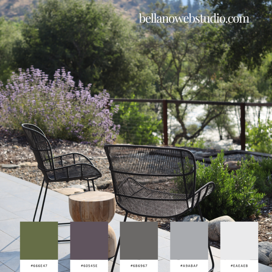
Perfect For:
This palette is ideal for outdoor brands, lifestyle blogs, wellness retreats, or any business looking to create a calming, nature-inspired design. It’s also perfect for minimalist designs that still want to capture the beauty of natural landscapes and serene outdoor environments.
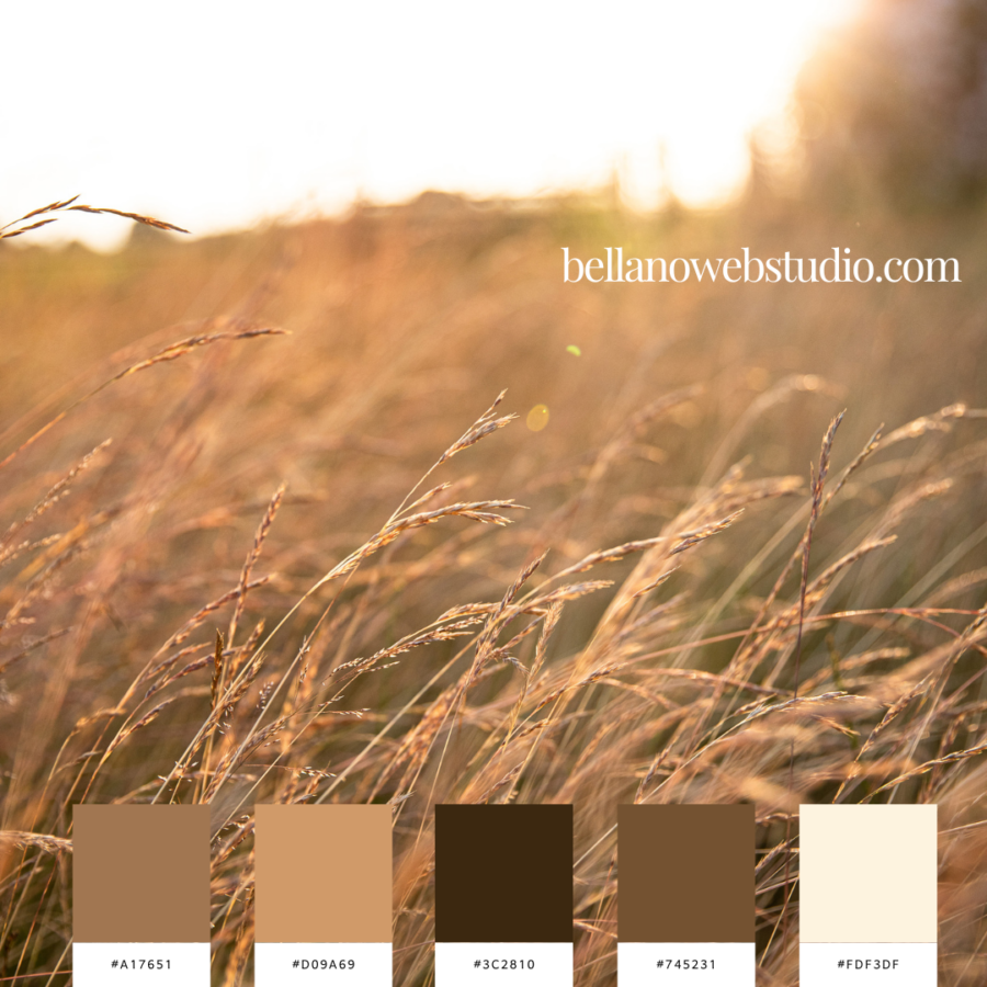
Golden Prairie
This palette is inspired by the golden glow of a late afternoon sun shining through tall prairie grasses, bringing the warm, earthy tones of nature to life. The combination of deep browns, golden tans, and soft cream evokes a sense of calm and tranquility, perfect for designs that want to feel both natural and timeless.
- Golden Sand – #A17651: A warm sandy tone that captures the beauty of sun-drenched landscapes. It evokes feelings of serenity and warmth, creating a rich foundation for any design.
- Honey Beige – #D09A69: This soft honey beige feels inviting and cozy, adding a gentle warmth that balances the deeper tones in the palette. It’s the perfect shade for creating harmony.
- Deep Chestnut – #3C2810: A rich, earthy brown that grounds the palette with its bold presence, adding depth and contrast. This shade embodies the warmth of autumn evenings.
- Wood Brown – #745231: This warm, wood-inspired brown adds a rustic charm, evoking the feel of natural materials and earthy textures. It brings balance to the palette with its versatility.
- Soft Cream – #FDF3DF: A delicate cream that lightens the palette, providing a soft, airy touch. It’s perfect for bringing brightness and a hint of freshness to the warm, golden hues.
Perfect For:
This palette is ideal for lifestyle blogs, home decor brands, or any business that wants to capture a warm, natural aesthetic. It’s perfect for fall designs or projects aiming to convey comfort, warmth, and the beauty of nature.
Whiskey by the Fire
This palette is inspired by the warmth and sophistication of a cozy evening, where the deep tones of whiskey, wood, and tailored fabrics come together to create a timeless and classy vibe. It’s perfect for designs that want to feel both elegant and grounded, with rich, moody hues balanced by soft neutrals.
- Whiskey Midnight – #1C2933: A deep, inky blue that feels strong and sophisticated—like the night sky during a quiet moment of reflection with a glass of whiskey in hand. It anchors the palette with its bold, almost mysterious quality.
- Aged Oak – #3E2B1E: This rich brown is reminiscent of aged oak barrels used for whiskey, adding warmth and depth. It’s the perfect complement to the darker tones, bringing a sense of history and craftsmanship.
- Taupe Wool – #A4958C: A soft, neutral taupe that evokes the feel of a well-worn wool coat, offering coziness and a touch of luxury. This hue adds a subtle sophistication to the palette without being overpowering.
- Warm Bourbon – #6D4C46: This warm, caramel brown brings to mind a smooth bourbon whiskey, adding richness and a touch of indulgence to the palette. It ties together the deeper tones while adding a welcoming warmth.
- Soft Ash – #DBD4CE: A soft, cool ash that lightens the palette, providing a clean, minimalist contrast to the richer tones. It’s the perfect neutral to balance out the warmth and create a harmonious feel.
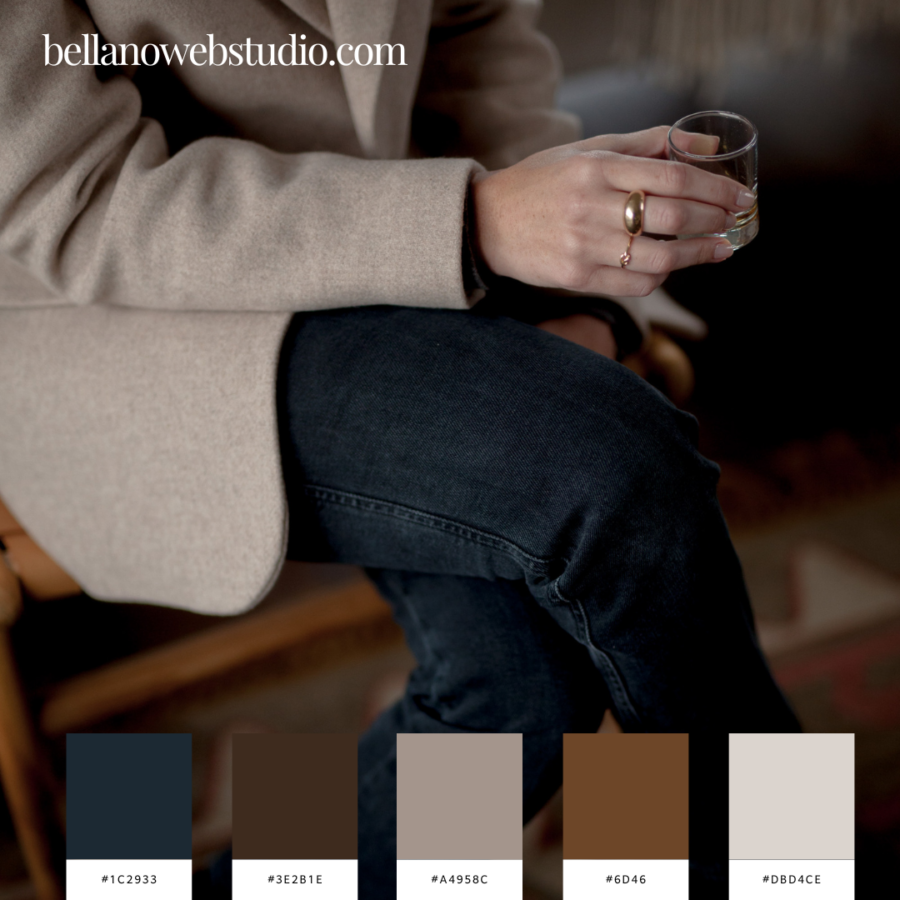
Perfect For:
This palette is perfect for lifestyle brands, men’s fashion, whiskey or beverage brands, or anyone looking to convey sophistication, comfort, and a touch of warmth in their designs. It’s ideal for fall or winter projects, evoking cozy nights by the fire with a glass of whiskey in hand. the beauty of natural landscapes and serene outdoor environments.
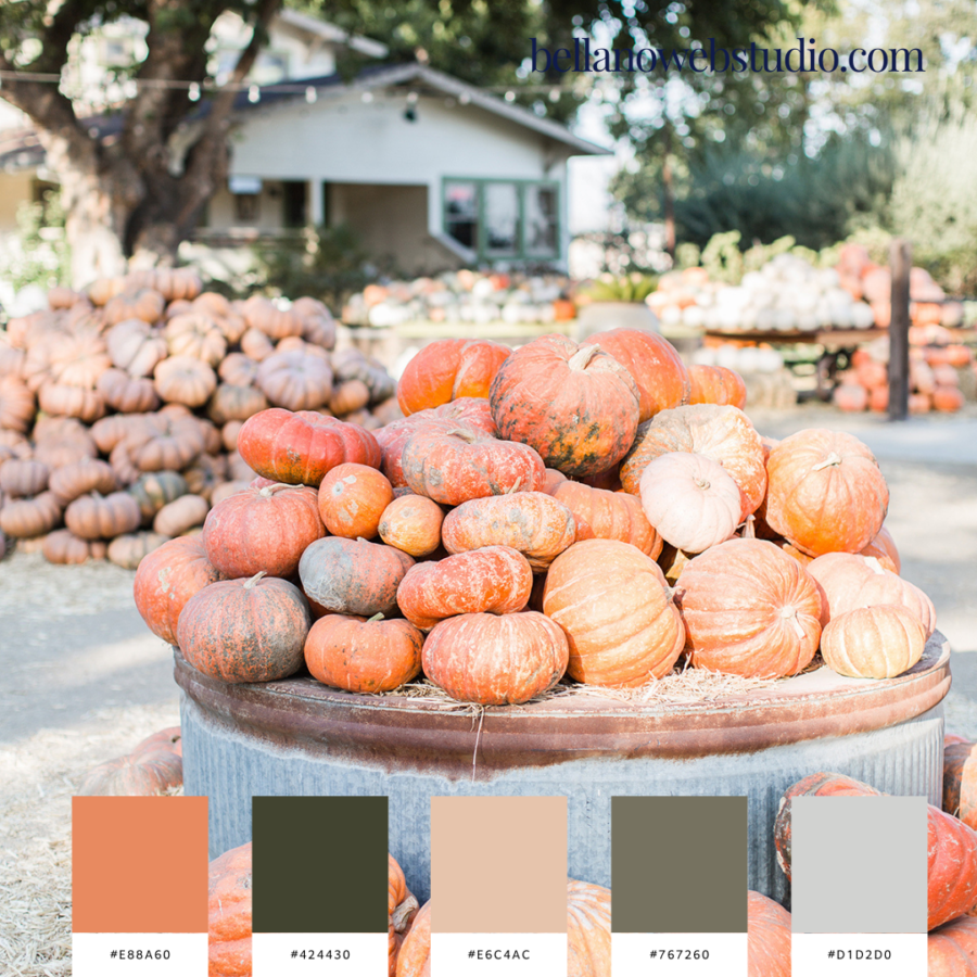
Pumpkin Patch Delight
This warm and earthy palette is inspired by the rustic beauty of a classic autumn pumpkin patch. Combining shades of pumpkin orange, deep greens, and soft neutrals, it evokes the coziness and nostalgia of crisp fall mornings spent picking pumpkins and sipping warm cider. This palette strikes a balance between vibrant warmth and grounded, muted tones, perfect for fall-themed designs.
- Pumpkin Spice – #E88A60: A warm, burnt orange that captures the essence of fall’s favorite gourd, adding energy and vibrancy to the palette.
- Harvest Green – #424430: This deep, earthy green is reminiscent of rich foliage, grounding the palette with its organic, natural feel.
- Toasted Beige – #E6C4AC: A soft, neutral beige that brings warmth and balance, reminiscent of a toasted marshmallow by the fire.
- Autumn Olive – #767260: A muted olive tone that provides a cool contrast to the warmer hues, adding depth and sophistication.
- Cool Fog – #D1D2D0: A light, misty gray that softens the palette, evoking the quiet, serene mornings of early fall.
Perfect For:
This palette is ideal for any fall-focused design, from seasonal branding to lifestyle blogs. It’s perfect for capturing the warmth and charm of autumn in a way that feels both cozy and polished.
Café Latte Moments
This palette is inspired by the quiet elegance of a perfectly poured latte, blending rich coffee hues with creamy neutrals and soft taupe. It’s a balanced and warm mix that evokes comfort, relaxation, and the satisfaction of a cozy morning ritual. These warm tones, combined with cool neutrals, create a sophisticated and calming vibe for any design.
- Mocha Brown – #564143: A deep, rich brown that grounds the palette with the warmth of freshly brewed espresso, perfect for adding depth and richness.
- Caramel Drizzle – #A96A41: This warm caramel hue adds a pop of golden sweetness, bringing energy and light to the overall mix.
- Warm Taupe – #B39890: A soft taupe that evokes a gentle warmth, balancing the bolder tones with a soothing, neutral feel.
- Latte Foam – #C0BEBA: A soft, light gray that feels like the gentle foam on top of your favorite latte, adding a subtle coolness to the palette.
- Whipped Cream – #DAD8D4: A delicate, creamy white that rounds out the palette, providing a fresh and airy contrast to the deeper coffee tones.
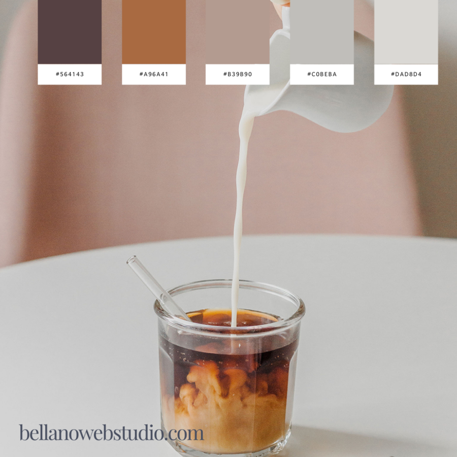
Perfect For:
This palette is ideal for coffee shop branding, lifestyle bloggers, or anyone looking to evoke a sense of calm, sophistication, and warmth in their designs. It’s perfect for creating cozy, welcoming vibes with a touch of elegance.
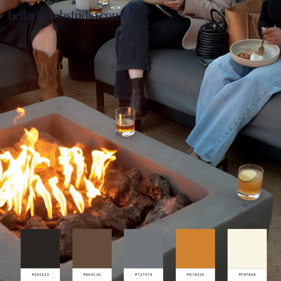
Bonfire Nights
This palette is inspired by the warmth and camaraderie of a cozy evening around a bonfire. The deep, earthy tones mixed with fiery orange and soft neutrals evoke the essence of fall nights spent with friends, whiskey in hand, as the flames flicker and dance. It’s a balanced blend of warmth and sophistication with a touch of rustic charm.
- Ember Black – #292523: A deep, smoky black that evokes the feeling of charred wood and embers, grounding the palette with boldness and depth.
- Campfire Brown – #664C3C: This warm, earthy brown adds a rustic charm reminiscent of weathered wood and outdoor warmth, tying the palette to nature.
- Ash Gray – #727579: A cool, muted gray that mirrors the ashes left behind from a bonfire, providing a soothing balance to the warmer hues.
- Flame Orange – #D1822E: This vibrant, fiery orange brings the heat, adding a bold pop of warmth and energy, like the flickering flames of a fire.
- Marshmallow White – #F9F6E6: A soft, creamy white that reminds you of roasted marshmallows, bringing lightness and balance to the darker, more intense tones.
Perfect For:
This palette is ideal for outdoor lifestyle brands, whiskey bars, rustic fashion, or any business looking to capture the warmth, comfort, and connection of cozy fall gatherings. It’s perfect for adding warmth and intimacy to designs while keeping them modern and grounded.
Autumn Joy
This palette is inspired by the playful, energetic spirit of fall—where leaves dance in the breeze and every moment feels alive with color. The warm reds, golden yellows, and earthy browns reflect the beauty of fall foliage, while soft grays and beige tones provide a grounding balance. It’s a joyful yet serene palette, perfect for designs that capture the magic of the season.
- Maple Red – #64140C: A deep, rich red reminiscent of turning leaves, adding boldness and warmth to the palette.
- Golden Leaf – #D0A757: This warm, golden hue captures the vibrant energy of freshly fallen leaves, adding a lively pop of color.
- Chestnut Brown – #7C4C3C: An earthy brown that evokes the grounded feel of fall’s natural elements, offering balance to the brighter tones.
- Autumn Gray – #978980: A soft, muted gray that reflects the quiet moments of the season, like an overcast sky or worn wooden bench.
- Warm Beige – #D7C6BA: A light beige that brings a touch of softness and neutrality to the palette, complementing the richer, warmer tones.
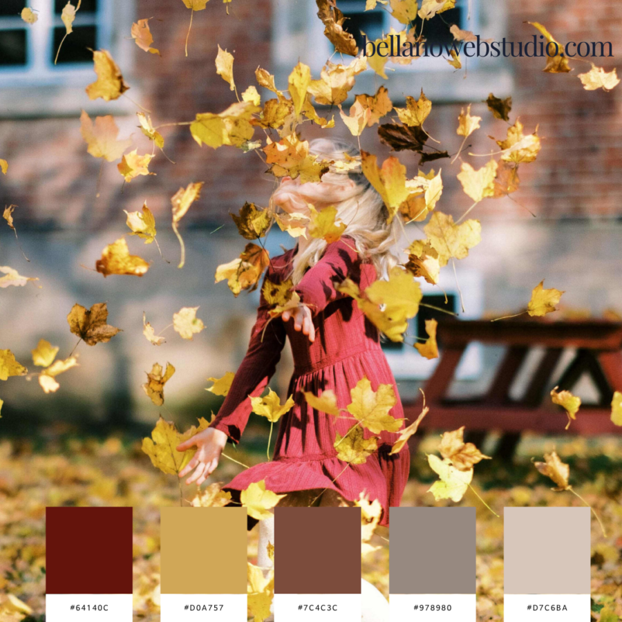
Perfect For:
This palette is ideal for seasonal branding, children’s fashion, lifestyle blogs, or anyone looking to capture the joy and color of fall in their designs. It’s perfect for evoking a sense of playful nostalgia while keeping things grounded with natural tones.
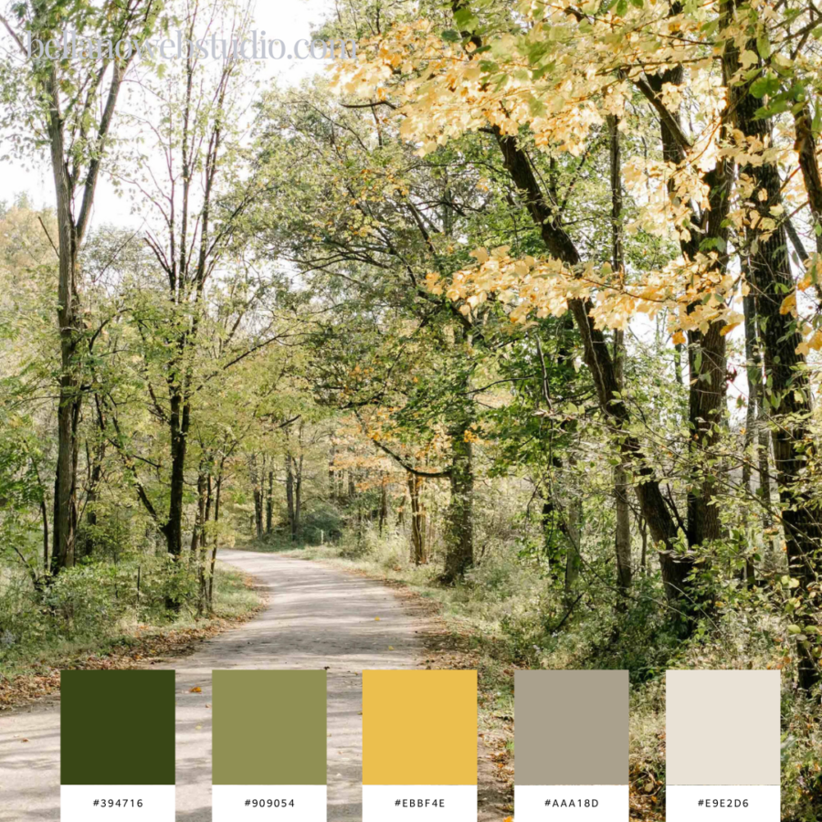
Woodland Walk
This palette is inspired by the serenity and beauty of a peaceful autumn walk through the woods. The rich greens, golden hues, and soft neutrals evoke the calm and refreshment of nature’s transition into fall. It’s perfect for designs that aim to capture the earthy, grounded feel of nature while offering a hint of autumn’s warmth.
- Forest Canopy – #394716: A deep, earthy green that grounds the palette with the richness of the forest, bringing a sense of calm and connection to nature.
- Olive Grove – #909054: This soft olive green is a nod to the muted, natural tones of the season, adding warmth without overpowering the design.
- Golden Harvest – #EBBF4E: A vibrant golden yellow that mirrors the changing leaves, adding a pop of energy and brightness to the palette.
- Moss Stone – #AAA18D: A warm, earthy neutral that evokes the texture of moss-covered stones, balancing the brighter hues with softness and subtlety.
- Morning Mist – #E9E2D6: A delicate, light neutral that brings a fresh, airy touch, like the soft fog on a cool morning walk through the woods.
Perfect For:
This palette is ideal for nature-inspired brands, eco-conscious businesses, or any design that wants to capture the tranquility and beauty of the natural world in autumn. It’s perfect for creating a sense of peace and grounding with warm, natural tones.
Feeling Inspired?
Fall is the perfect time to refresh your designs. Whether you’re restyling a website or building out your branding, using these fall color palettes will give your project a warm, welcoming feel that connects with the season. Each palette offers something a little different, but they all tap into the cozy, crisp energy that makes fall so magical.
What colors are calling to you this season? 🍁