Tips on Using Colors with Personality
Choosing your color palette can be one of the most challenging choices you will make about your branding. Color is the most noticeable piece of your brand and your website, followed by font choice.
Selecting your brand colors can simply be a personal choice. You “can” choose your favorite color for your branding. If your brand is closely tied to you as a person this is an easy way to choose your main color. For me, Bellano = Thauna. My favorite color is purple. I cannot even imagine NOT using purple as my main brand color because I am so connected to purple and Bellano is me and the expression of my creativity. My challenge then becomes, what shade(s) of purple and what colors coordinate with it best.
Or you can focus on the personality traits of the colors and how they correspond to what you want your brand to convey. For example, if your brand’s key traits are vibrant, trustworthy, and creative maybe consider a palette with orange and blue (or one of them).
In the end, you need to love your color palette, whether it’s a personal favorite or one that represents your brand’s personality.
This post is not a deep dive into color theory but I wanted to give you a high-level list of color personality traits to keep in mind while exploring colors for your brand and website.
Warm Colors.
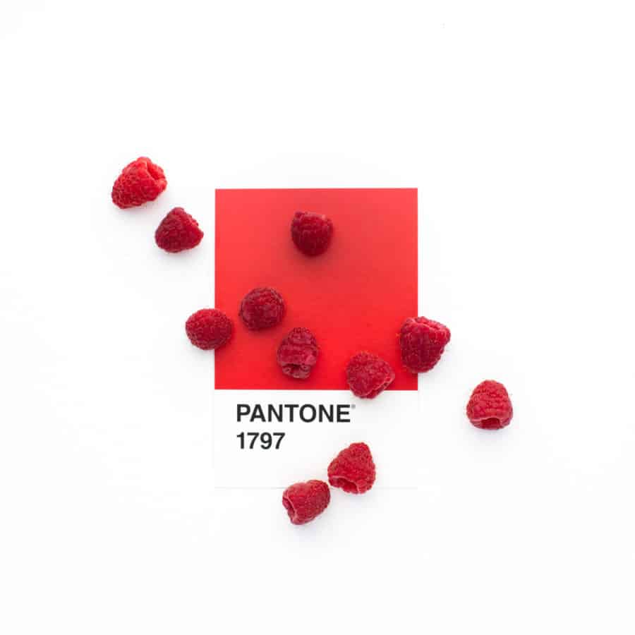
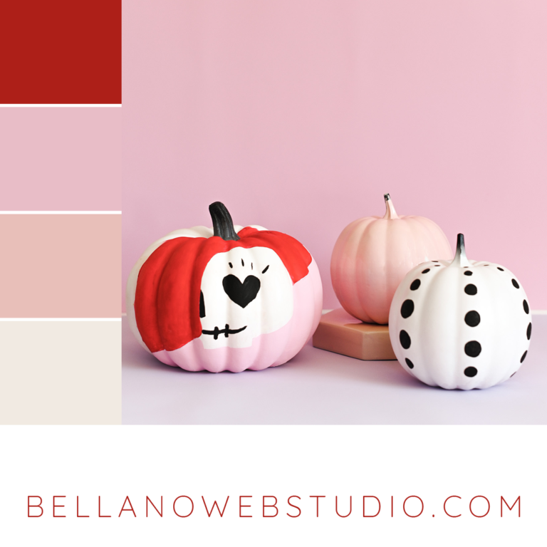
Red
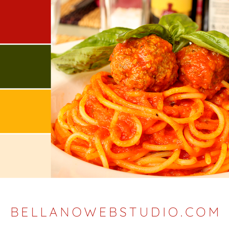
Red is a powerful color and can be overwhelming if used too much. Combined with green it makes you think of Christmas, however, paired with other colors (I love red with turquoise) it can be elegant and powerful.
- hot
- fire
- passion
- attention
- prosperity
- good luck
- stop
- danger
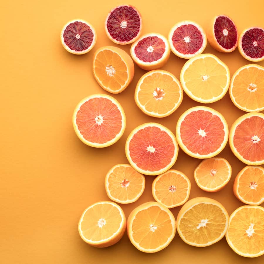
Orange
Orange is vibrant and energetic on its own. However, if it’s paired with more earthy tones it becomes more subtle. To harness the vibrancy of orange pair it with other vivid colors.
- vibrant
- creativity
- healthy
- vitality
- energy
- change
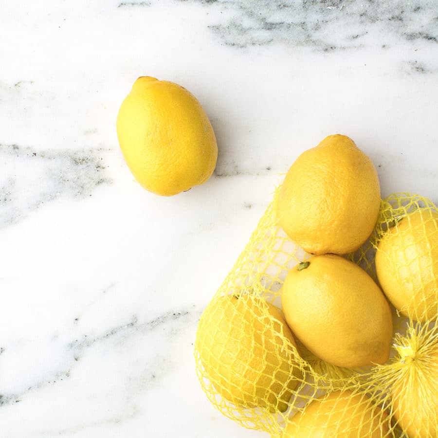
Yellow
Yellow is the most energizing of the warm colors. On screens it can be too bright at times but the right shade of yellow can be a ray of sunshine.
- happiness
- sunshine
- hope
- cheerful
- freshness
- calm
- cowardice
- danger
Cool Colors.
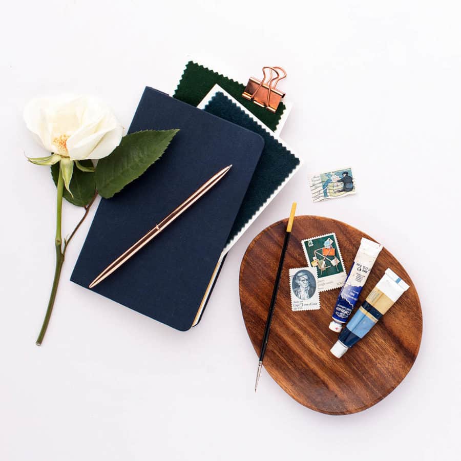
Blue
Shades and hues of blue have a variety of meanings. Bright blues are energizing (especially paired with yellow). Lighter blues are calm and relaxed. Dark blue is a good choice for corporate brands that want to be seen as strong and trustworthy (dark blue with orange can convey reliable but innovative).
- calm
- responsible
- peace
- spiritual
- relaxed
- trustworthy
- refreshing
- sad
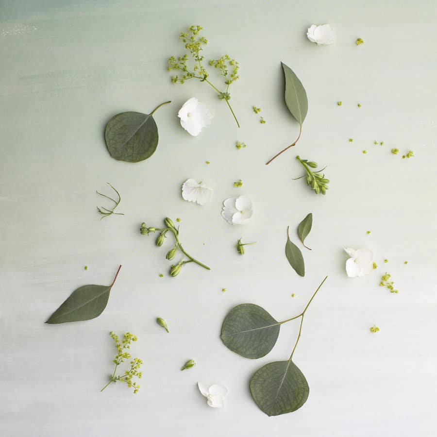
Green
Green represents the earth and growth. It can be a good choice for food brands because it also conveys freshness and healthy living. It can bring balance to palettes with other strong colors.
- beginnings
- growth
- freshness
- energy
- health
- renewal
- nature
- jealousy
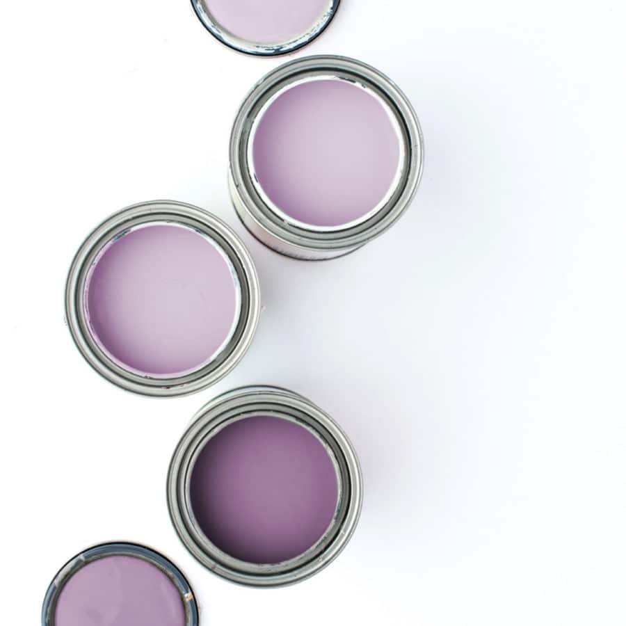
Purple
In ancient times purple was the color of royalty, because of this purple still brings a sense of luxury. It is also associated with creativity and imagination and is a romantic color.
- creativity
- luxury
- romantic
- wisdom
- peace
- expensive
- pride
- imagination
Have fun with it and experiment with color. If neutrals are more your thing, check out this post.
If you would like some inspiration check out these posts with color palettes, my portfolio, or my I Love Color Pinterest board.
