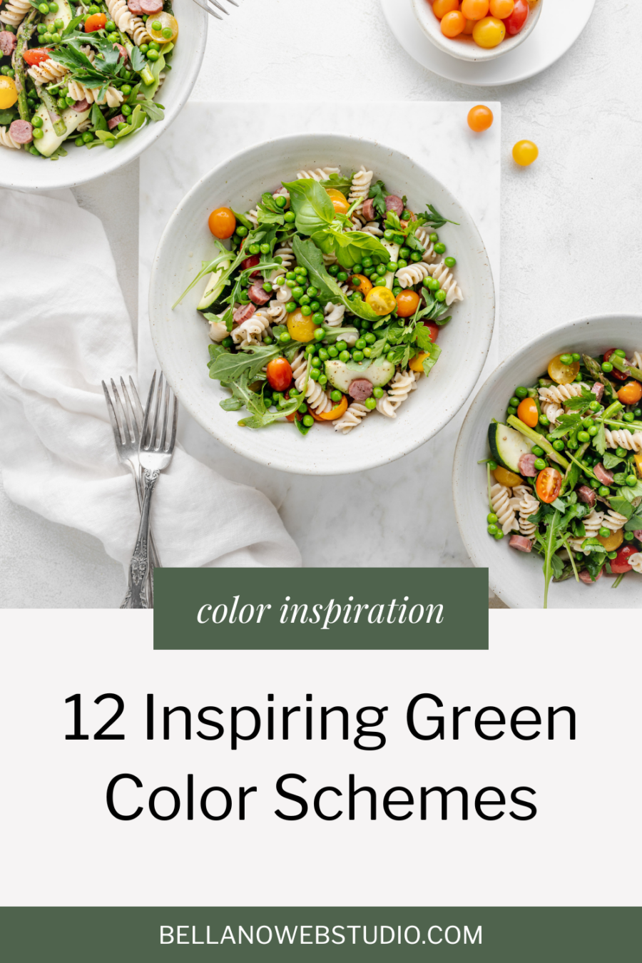
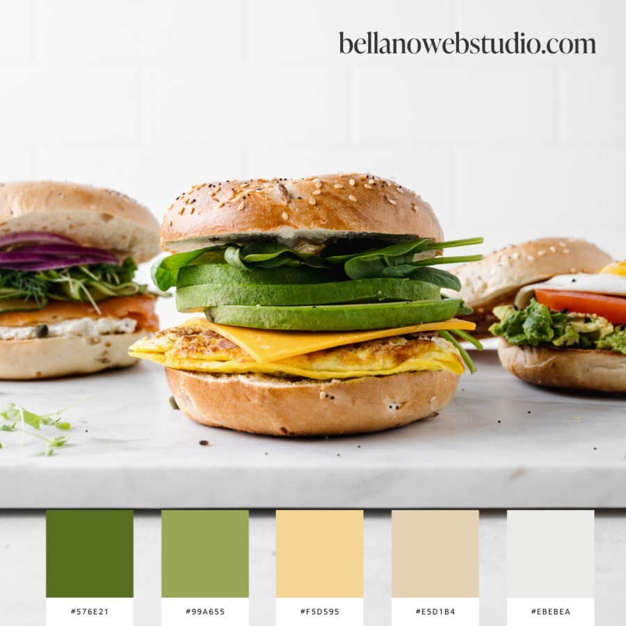
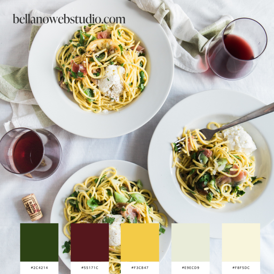
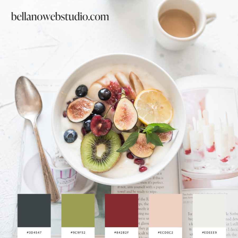
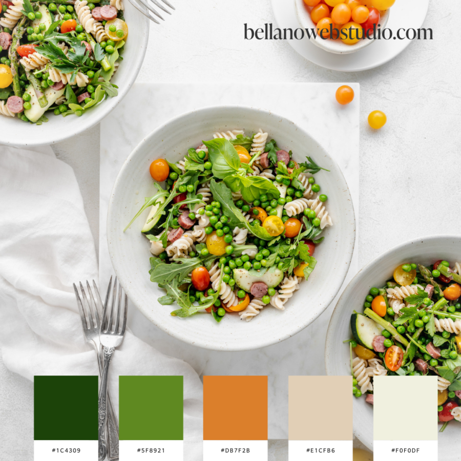
12 Inspiring Green Color Schemes
Embracing Spring with Green Color Schemes
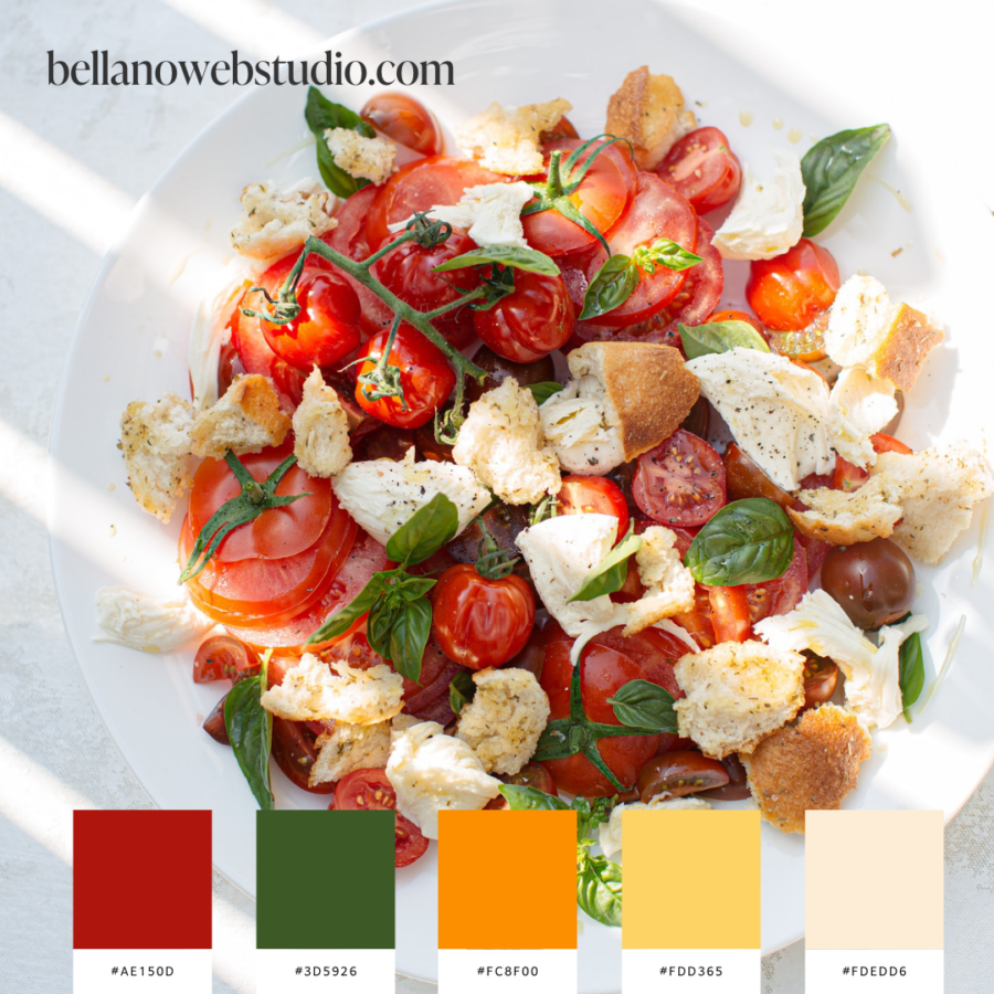
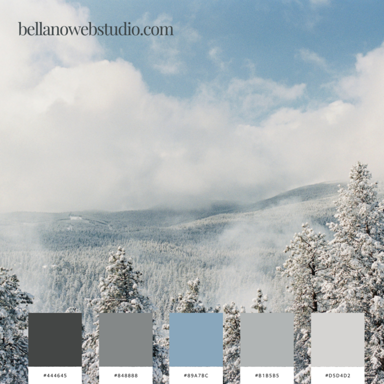
As the frost melts and the first buds of spring appear, no color captures the essence of the season quite like green. Here in Utah, the arrival of spring is a dramatic transformation. Each year, the landscape shifts from a blanket of white to a burst of green, reminding us why we endure the chill of winter. It’s a time of renewal and rejuvenation, and what better way to celebrate than by refreshing your brand with a new color scheme centered around green?
Why Choose Green?
Green is more than just a color; it’s a symbol of growth, vitality, and new beginnings. It’s associated with balance, nature, and calmness, making it an excellent choice for brands looking to convey these attributes. Whether you’re launching a new product or revitalizing your website, incorporating shades of green can breathe life into your branding and connect with your audience on an emotional level.
Discovering Your Shade of Green
There are countless shades of green, each conveying different moods and styles. Choosing the right shade is crucial in setting the tone for your brand.
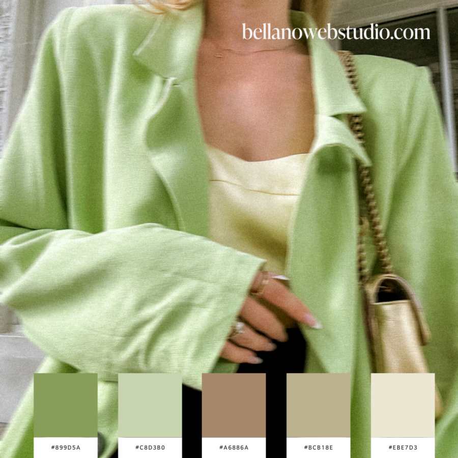
- Soothing Pastels: Soft greens like mint or seafoam are perfect for brands aiming for a gentle, calming presence. They work well in health and wellness industries or any brand focusing on tranquility.
- Vibrant Emeralds: For a more dynamic and luxurious look, deeper greens like emerald or jade can make a bold statement. These colors are ideal for premium services or products, suggesting richness and exclusivity.
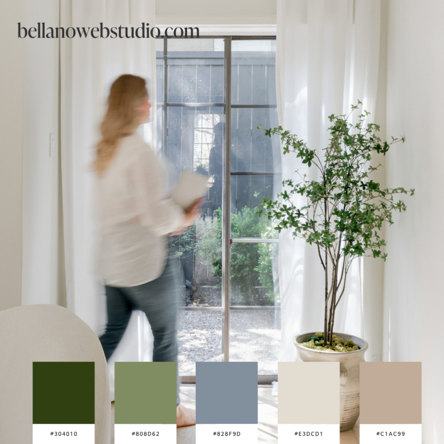
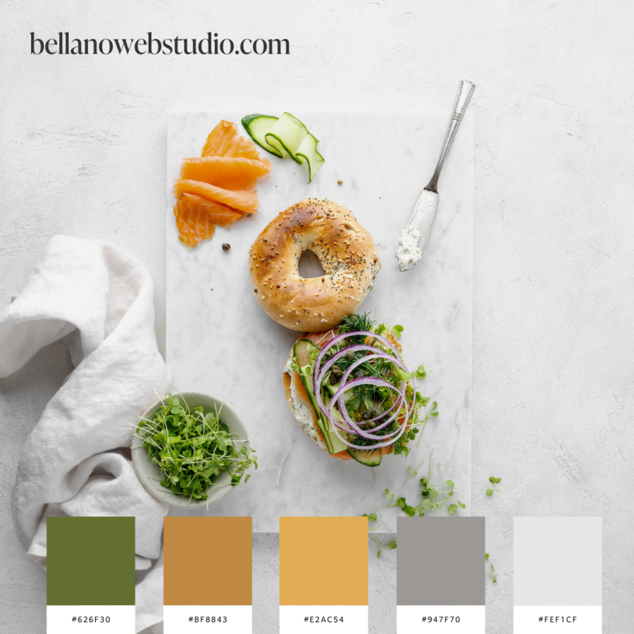
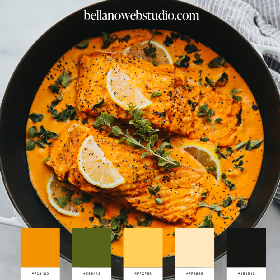
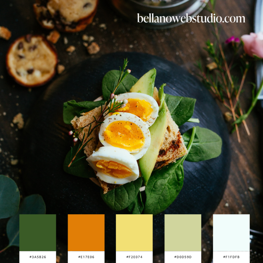
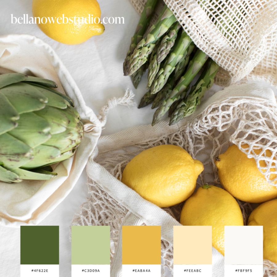
- Earthy Tones: Olive or moss green reflect stability and growth. These tones are great for eco-friendly brands or organizations that want to emphasize their connection to nature.
Mixing and Matching Green in Your Color Palette
Once you’ve selected a primary shade of green, pairing it with complementary colors can enhance its impact. Here are a few combinations to consider:
- Green and White: This classic combination is clean and crisp, perfect for a minimalist aesthetic that wants to keep things fresh and bright.
- Green and Navy: For a more professional and trustworthy feel, navy adds a serious tone that complements the liveliness of green.
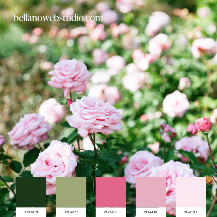
- Green and Pink: This duo can be playful and vibrant, suitable for brands that want to project youthfulness and creativity.
Design Inspiration with Green
To spark some creativity, let’s explore a few practical applications of green in branding and design:
- Websites: Use green for call-to-action buttons or as part of your background to create a vibrant, eye-catching look.
- Logos: Incorporate green into your logo to make your brand instantly recognizable and associated with growth.
- Packaging: Green packaging can convey sustainability, a critical factor for consumers increasingly concerned about the environment.
More color schemes
- Exploring 12 Navy Blue Color Palettes to Love
- California Dreaming: Vacation Color palettes
- Choose the Perfect Summer Color Palette for Your Brand
- Food-Inspired Color Palettes
- Spring Color Palettes
Unlock More with Bellano Web Studio
At Bellano Web Studio, I understand the power of color in branding. As we embrace the new beginnings of spring, I invite you to explore our curated collection of green-inspired designs. Whether you are looking to update your existing brand or start a new project, I am here to help your designs flourish.
Don’t forget to sign up for the newsletter for exclusive access to the FREE Library filled with design resources and insider tips. Let’s make your brand stand out this spring with the refreshing power of green!
Did you find this post helpful?
Share the love and save it to Pinterest!
