Small Screens, Big Impact: How to Adjust your Kadence Blocks for Mobile Views
Rock Your Mobile Views by Mastering the Kadence Block Settings
With Kadence Blocks, you can create stunning posts and pages on your WordPress site more easily than ever before!
However, what looks great on your desktop might not look great on mobile views. You want your content to look amazing on all devices, so don’t forget to check on your phone and your tablet. Some Kadence Blocks will need to be adjusted for mobile view. But don’t worry—it’s not as daunting as it sounds!
In this post, I will provide some simple tips and tricks for making your Kadence Blocks mobile-friendly. Let’s ensure your website shines on every screen!
Here are some tips on how to adjust Kadence Blocks for mobile views:
Before making any adjustments to your Kadence Blocks, it’s important to preview your design in mobile view. WordPress has a built-in mobile preview option that lets you see how your content will look on a mobile device. To use this feature, click on the “Preview” button at the top of the page (in the edit screen) and select “Mobile” from the drop-down menu.
Once you’re in mobile preview mode, you can see how your blocks will be displayed on a mobile device. This will give you a good idea of how much work you need to optimize your mobile design.
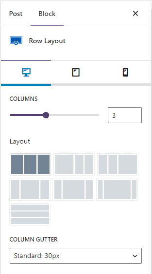
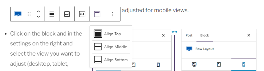
The Row Layout Block is one of my all-time favorite features of Kadence Blocks. This block makes it so easy to design responsive custom content layouts that look great on all devices. With this block, you can create a Row Layout of columns (from one to six) and adjust their widths to fit your content perfectly. Plus, you can add other Kadence Blocks inside each column to create complex designs that will impress your visitors. Whether you’re creating your homepage, a blog post, or a landing page, this is my go-to block because of its versatility.
However, sometimes the block needs to be adjusted for mobile views.
- Click on the block, and in the settings on the right, select the view you want to adjust (desktop, tablet, mobile)
- Adjust the layout for smaller screens. For example, for mobile, you may want to move from 3 columns side by side to 3 columns stacked on top of one another.
- You can also choose the order in which the columns will collapse (left to right or right to left).
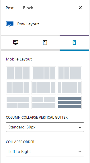
You may also need to adjust the spacing between columns above and below the block. This will help your content look great on all screen sizes.
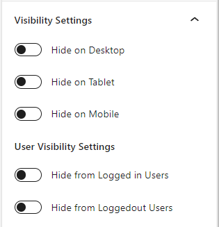
Certain blocks or elements of your design may not be necessary or appropriate for mobile view. In these cases, you can use the Kadence Blocks mobile visibility option to hide these elements on mobile devices. Note: not all blocks have the Visibility setting.
To do this, select the block or element you want to hide and click on the “Visibility Settings” tab. From there, you can choose where you want the block to show.
PRO TIP: You can create two versions of the same block one for desktop and one for mobile and set the visibility settings accordingly.
Text that looks great on desktop screens may be too large on mobile, wasting valuable screen real estate and causing unnatural line breaks. Or some content may be too small to read on a mobile device. To ensure that your text is legible on all devices, you can adjust the font size in Kadence Blocks.
To do this, you will need to be using the Kadence Advanced Text (not the regular Gutenberg Heading block). Select the text block you want to adjust, and in the Font Size section, click on the icon to choose desktop, tablet, or mobile. You can then adjust the font size to make it more suitable for mobile devices.
Padding is the space between the content and the edge of the block. When designing for mobile view, it’s important to ensure that there is enough padding around each block. Be mindful of “too much” padding on mobile. What looks great on your desktop might be too much white space on mobile devices.
To adjust the padding in Kadence Blocks, select the block you want to adjust and click on the “Spacing Settings” (or Padding/Margin Settings) tab in the settings. Choose the desktop, tablet, or mobile icon and adjust the padding to make it more suitable for mobile view.
Background colors can make your content stand out on mobile devices. To adjust the background color, select the block you want to adjust and click on the “Background Settings” tab in the toolbar. From there, you can select the background color you want to use.
In some cases, you may want to adjust the width of a block to make it more suitable for mobile views. To do this, use a Row Layout block to nest the content you want to adjust. In the Row Layout settings that display above the block, you can adjust the block’s width to set the max width.
Margin is the space between blocks or elements. When designing for mobile view, it’s important to ensure that there is enough margin around each block to make it easy to tap on mobile devices.
To adjust the margin in Kadence Blocks, select the block you want to adjust and in the “Spacing Settings” (or Padding/Margin Settings) choose the icon for desktop, tablet, or mobile. From there, you can adjust the margin to make it more suitable for mobile views.
Vertical alignment in the Row Layout Block can help ensure that your content looks the way you want it to on all devices. To adjust the block alignment, select the block you want to adjust and click on the Vertical Alignment setting in the Kadence Blocks toolbar. From there, you can choose the best alignment option for your design.
After making adjustments to your Kadence Blocks for mobile view, it’s important to test your design on multiple devices. This will help you to ensure that your content looks great on all devices, including smartphones and tablets.
You can use tools like Google’s Mobile-Friendly Test to check how your website looks on different devices. This will help you to identify any issues and make further adjustments as needed.
More tips on using blocks
- How to Use Reusable Blocks
- Video: Adjusting Kadence Blocks for mobile views in the FREE Tutorial & Resource Library
Adjusting Kadence Blocks for mobile views is essential to ensure your content looks great on all devices. Using the tips outlined above, you can create a responsive, user-friendly design that impresses your visitors on any device. Remember to test your design on multiple devices to ensure it looks great and functions properly for all your users. With Kadence Blocks, you can create beautiful and responsive designs that will help to grow your online presence and engage your audience.
Supercharge your WordPress site with Kadence Pro
Get more design flexibility, faster load times, and powerful features to create a website that stands out! Use my link below for 15% off any plan (except lifetime)!
Did you find this post helpful?
Share the love and save it to Pinterest!