8 Reasons the Kadence Theme is my Favorite
What is Kadence and why do I choose it over Genesis?
Kadence is a free WordPress theme and works like other WordPress frameworks (Genesis, Divi, Elementor, etc.) and it can be used on its own or with a child theme. Of course, like most things in life, the free version is great but the Pro version is even better. The free version is still running circles around sites I built on Genesis in the past. I’m finding more reasons to love Kadence with each new project, below you will find the 8 reasons the Kadence Theme is now my favorite and why I build every new site using it instead of Genesis.
Why Kadence changed the game and how I build sites here at Bellano.
Kadence vs Genesis
I was a Genesis fangirl for years and years. Before I was introduced to Kadence I only worked on the Genesis Framework from the start of my WordPress design business. You don’t need to worry if your current site is built on Genesis, it’s still a good, rock-solid framework. However, when it’s time for a redesign you may want to consider Kadence.
I want to share a bit with you about why I will use the Kadence theme for new projects going forward. (I do still maintain all my previous client sites built on Genesis, however, you can expect some advice on why you should make the change.) Kadence offers new features that are not (currently) available with Genesis.
8 reasons the Kadence Theme is my favorite (and why you will love it too):
- Speed. Kadence is scoring much faster than even my most current Genesis sites. One piece of the speed puzzle is current code and meeting new Google speed criteria. Speed is a moving target, and there are other factors, such as a quality host (thumbs up for Flywheel) and image size, but you want to have as many boxes checked as possible when it comes to speed.
- Integration. Kadence is deeply integrated with Gutenberg and the block editor. It even adds some cool block features to make your posts and pages even more flexible. It is amazing with WooCommerce.
- Custom Headers and Footers. Kadence makes it so easy for you to tweak your header and footer areas. The widgets in Genesis for the header and footer could sometimes be clunky and hard to tweak easily on the fly. Kadence makes changing your header or footer so much easier. (Of course, I’m always available to do it for you if you don’t want to mess with it…but it will be easier for you to make those changes if you desire after launch.)
- WooCommerce. Several cool built-in features for WooCommerce are available with Kadence Pro (included in my services).
- Security. It is coded with a high level of security, and updates are released regularly to keep hackers at bay.
- Beauty. As a designer, I am having the best time working with Kadence. The sites are beautiful, and the layout options are practically limitless.
- Easy to use. A redesign or new design project involves many design decisions, and that’s where I come in. ? I’m here to make it easy and help you make those decisions. I will take your wishlist and make it happen. I figure out the “how” for you. However, once your site is launched it’s great to have a theme that is easy to use and gives you the ability to make changes whenever you like. Kadence offers much more flexibility, is more intuitive, and is easy to use in the backend. You can even see your changes on the screen when you use the customizer before you commit to them.
- Additional blocks. As I mentioned above, Kadence is deeply integrated with Gutenberg. It adds 14 blocks to add features without the bloat of plugins. You can easily add things like testimonials, galleries, and forms to any post and page. The pro version of the Kadence blocks adds more block options. (The pro version is included in all my design packages.)
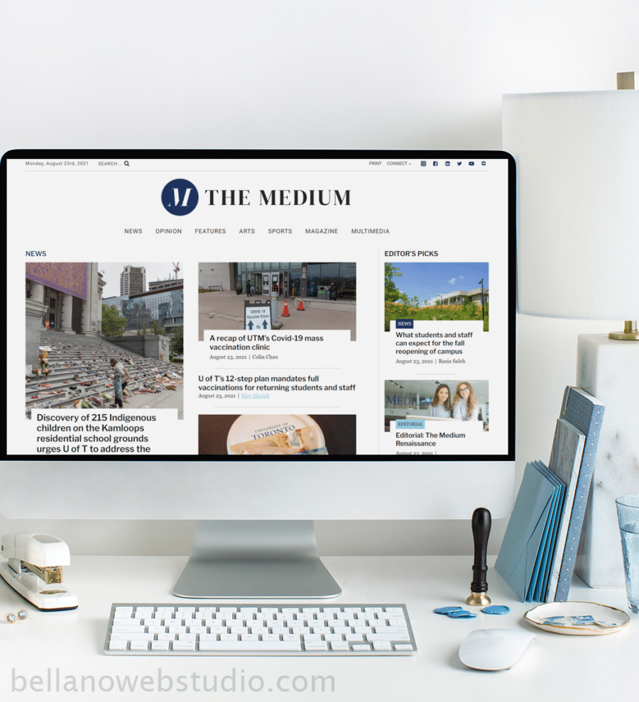
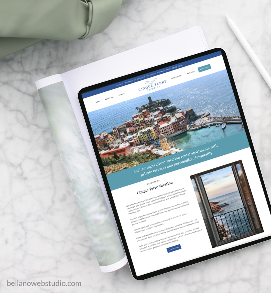
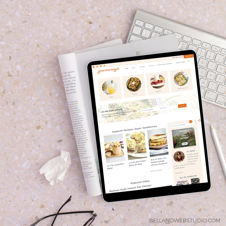
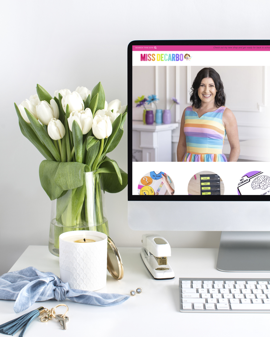
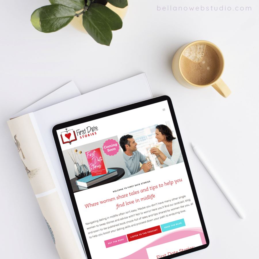
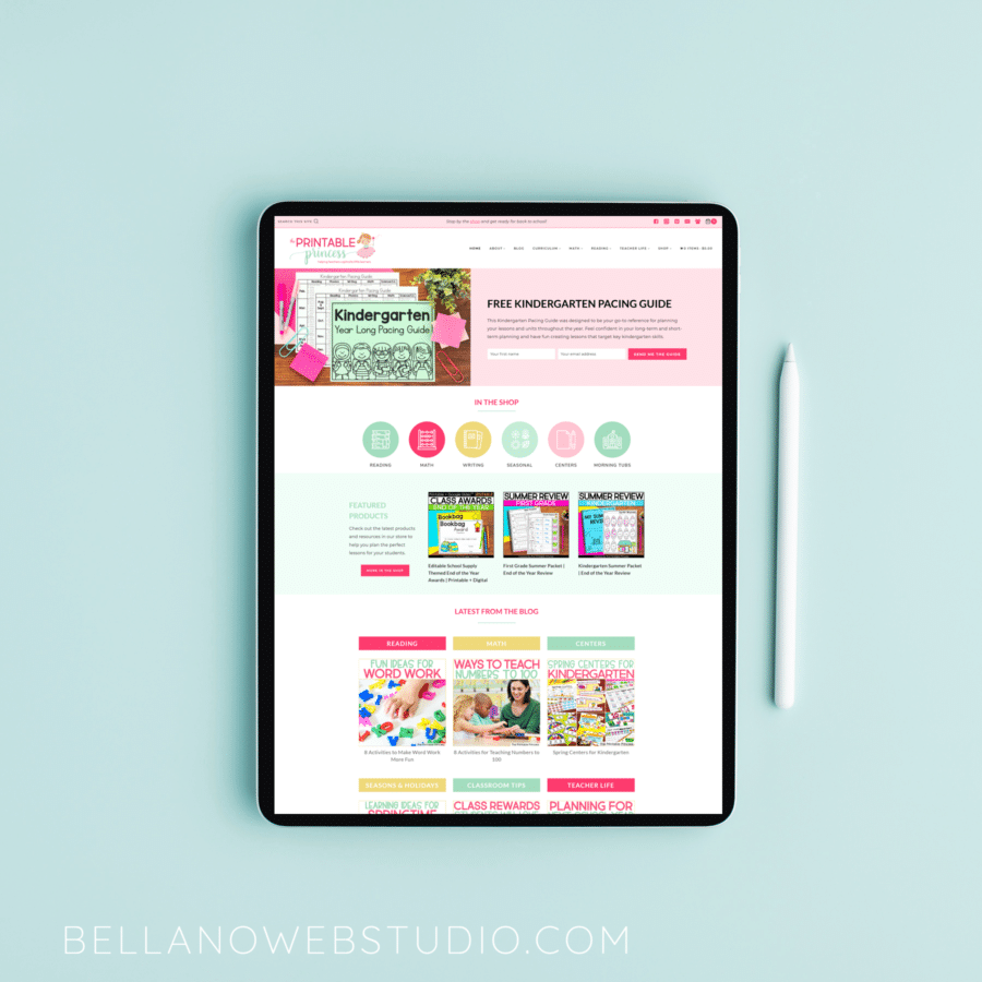
Check out these recent projects that were built with the professional version of Kadence and custom child themes.
Kadence has been a game-changer.
You know how fast things have been changing with WordPress recently. There have been huge improvements with code and features over the past 1 to 2 years. Eventually even beautiful and well-designed websites will start to show their age and speed may suffer. Either because they are no longer trendy, look outdated, or because they don’t keep up with the new code and features. I usually recommend a new design every 3 years but the new improvements have increased that to 1-2 years.
Here’s a note I received from Casey after her redesign and moving GoodFoodStories.com to Kadence this year:
If you have been considering a redesign I recommend going with Kadence.
Supercharge your WordPress site with Kadence Pro
Get more design flexibility, faster load times, and powerful features to create a website that stands out! Use my link below for 15% off any plan (except lifetime)!
Are you ready for a website you’ll love?
Did you find this post helpful?
Share the love and save it to Pinterest!
